Rihanna logo and symbol, meaning, history, PNG
- Robin Rihanna Fenty became popular in the middle of the 2000s, after relocating to the United States.
- 2005 — 2006 The initial logo for Rihanna was designed in 2005 and featured a bold yellow cursive lettering with thick sleek lines and rounded edges.
- The letters had a delicate shadow, which made them look three-dimensional.
- This logotype looked great on dark and contrasting backgrounds of album covers and posters.
- 2007 — 2009 The timeless elegance.
- This is how the Rihanna logo from 2007 can definitely be called.
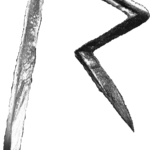
- 2009 — 2010 The first sharp “R”, which became iconic in no time, was introduced to the audience in 2008.
- 2010 — 2011 In 2010 the Rihanna “R” was redrawn in a new style and palette.
- Though the shape and the contour of the letter remained untouched, the insignia started looking different in the new light pink palette with small green and white accents.
- This new color scheme made the angles look smoother, and created a different tender and soft overall mood, adding a girly touch and showing a new weaker side of the strong woman singer.
- 2012 — 2016 The most famous and recognizable logo was designed in 2009.
- A simple stylized letter “R” with open contour and sharp angles was executed in many different colors and patterns.
- Each style was created to better suit the background and placement, so any possible idea could be supported by this iconic logo.
- The new style was supported by the new visual identity — now it is a simple and strict black sans-serif wordmark with bold sleek letter lines.


Leave a Review