Rider Broncs logo and symbol, meaning, history, PNG
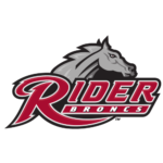
- Download PNG Rider Broncs Logo PNG The athletic logo of Rider University in Lawrenceville, New Jersey, was inspired by the name of the program, the Rider Broncs.
- Meaning and history 1977 – 2006 Both the previous Rider Broncs logo and the current one feature a horse.
- And yet, they look totally different.
- The creature on the old logo (1977-2006) is cartoonish and oversimplified.
- Although the horse has a fierce expression on its muzzle, you can hardly take its serious.
- 2007 – Today The 2007 logo looks more professional.
- The horse’s head bears a determined expression, and there is a lot of dynamism in the logo.
- The typography used for the lettering “Rider Broncs” (specifically, the extended end of the “R”) adds some motion, too.





Leave a Review