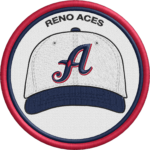
Reno Aces logo and symbol, meaning, history, PNG
- Meaning and history The team was established under the name of the Tucson Toros, then played as the Tucson Sidewinders from 1998 to 2008.
- The current brand identity was introduced in 2009.
- Primary symbol The focal points of the Reno Aces logo are a script “A” in the word “Aces” and a baseball, over which the “A” is placed.
- The letter is dark blue with white trim, while the ball is white with a dark blue outline and red seams.
- Even the fact that the lettering “Reno” is italicized doesn’t help to create a visual link between the two parts of the team’s name.
- Secondary emblem The alternative logo has been probably inspired by playing cards.
- The design is placed inside a light grey rhombus.
- Colors The four-color palette comprises dark blue, red, a noble shade of silver, and white for the background.






Leave a Review