ReMax logo and symbol, meaning, history, PNG
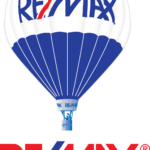
- Meaning and history The original ReMax logo was unveiled in 1978.
- Today, the network boasts the largest hot-air balloon fleet including nearly 120 hot-air balloons.
- Back then, it was accompanied by the motto “Above the Crowd!” 1973 – 2017 In the course of time, the slogan was removed, though.
- If you take a look at the modification of the emblem introduced in 2005, you’ll see only the name of the company.
- The proportions of the blue, white, and red parts were slightly altered.
- The design of the basket was also somewhat tweaked.
- Nevertheless, the updated probably weren’t visible for those who hadn’t compared the emblems side by side.
- 2017 – Today Apart from the slight adjustment mentioned above, the original ReMax logo remained untouched for 44 years until eventually, the company introduced a refreshed look at the annual Re/Max Broker Owner Conference in San Francisco in August 2017.
- The company representatives emphasized the fact it wasn’t a brand revolution, just an evolution.
- The white lines separating parts of the hot-air balloon are gone.
- Due to this, the blue and red patches look more vivid.
- They still have some volume due to the gradient effect.
- The basket and the part of the hot-air balloon above it were also simplified.
- Also, the 2017 version includes grey accents.


Leave a Review