evolution history and meaning
- It was a lowercase sans-serif inscription with the blurred uneven letters placed pretty far from each other.
- The “R” was the only written in white and placed on a solid black circle, other letters were all black.
- 1994 — 2000 For “The Bends” album the new Radiohead logotype was created in 1994.
- This time the inscription was written in all capitals and executed in an extended and solid sans-serif typeface with smooth angles and clean contours of the letters.
- The font, used for this emblem was Microgramma Bold.
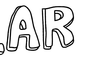
- 2000 — 2003 The redesign of 2000 brought a new logotype for the band, and it could be seen on the cover of their “Kid A” album.
- The new capitalized wordmark was executed in a bold sans-serif typeface, which was very similar to BD Plakatbau, with pretty massive structures and a sense of style and modernity.
- 2000 — Today The most iconic Radiohead logo was designed in 2000 and is still used by the band.
- This was the first and only emblem with no lettering on it.
- The new emblem got nicknamed “Modified Bear”.
- 2003 — 2007 For the band’s “Hall of The Thief” album, the monochrome logotype was rewritten again.
- 2007 — 2011 In 2007 the band starts using a clean and confident sans-serif typeface for its capitalized logotype.
- 2016 — Today The redesign of 2016 brought a new style to the Radiohead visual identity, writing its capitalized logotype in a traditional medium-weight sans-serif typeface, where each detail and touch are perfectly balanced.
- For promotional and advertising materials the letters of the wordmark may be emboldened and blurred, while the white negative space of “R”, “D”, “O”, and “A” are being colored black.


Leave a Review