Radford Highlanders logo and symbol, meaning, history, PNG
- Download PNG Radford Highlanders Logo PNG The teams representing Radford University in intercollegiate athletics are nicknamed Radford Highlanders.
- They have a pretty complex and difficult to reproduce logo.
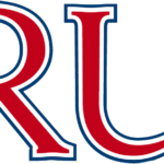
- Meaning and history 1982 The Radford Highlanders logo from 1982 featured a simple yet confident and elegant badge in black, red, and white, with the “RU” lettering enlarged and making the main part of the composition.
- The two letters were written in a bold red modern serif font and outlines in white and black contours of the same width.
- The elegant and smooth letters with square serifs were placed above the “Highlanders” inscription in the black stylized typeface.
- 2008 The redesign of 2008 kept the color palette and the composition of the previous version and even left the upper “RU” line of the logo almost untouched.
- All the main changes were made to the bottom, “Highlanders”, part.
- The first “H” was overlapping the “R” above it.
- It is based on the shield shade.
- The lower half of the sword is filled with a geometric pattern in red, blue, and white.
- The word “Radford” can be seen above the “R.” The letters are red, while the background is white.
- What is Radford Highlanders?
- Radford Highlanders is the name of the athletic program from the Radford University, located in Radford, Virginia.
- The program consists of 15 men and women teams in various sports disciplines, including basketball, golf, soccer, and many others.





Leave a Review