Rabobank logo and symbol, meaning, history, PNG
- Download PNG Rabobank Logo PNG Both the main elements of the Rabobank logo bear a deep symbolic meaning and convey the bank’s idea of the type of relationship it’s trying to establish with the customers.
- Meaning and history The name of the company originates from two banking cooperatives that used to work in the country at the end of the 19th century: “Ra” was taken from “Raiffeisen” “Bo” came from “Boerenleenbank,” which in translation from Dutch means “Farmer’s Credit Bank” By 1940, there was a lot of collaboration between the two cooperatives, and in the course of time, the bonds were growing even tighter.
- Eventually, in 1972, they merged and formed a single organization with its headquarters in Amsterdam.
- The name Rabobank Nederland was used as of 1980.
- 1994 – 2008 2008 – Today Very soon, the bank started to expand internationally establishing joint ventures in such countries as Indonesia, Australia, New Zealand, and, eventually, the US.
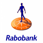
- Symbol The visual core of the Rabobank logo is formed by a stylized orange sundial and a human figure in blue.
- Interestingly enough, there’s no pole in the center of the sundial.
- The human figure, who has placed his or her foot in the center of the sundial, casts a shadow similar to the pole.
- Come to think of it, this is not just a randomly chosen design but a visual metaphor revealing the bank’s core values and its approach to customer relations: the bank is trying to emphasize the role of its customers.
- Hidden meaning behind the emblem According to the company, the sundial is used to symbolize the long-lasting connection between the bank and its customers, to emphasize that the bank is ready to serve its clients “as their needs change over time” and that it helps people and businesses “to achieve their financial goals at every stage of life.” Font Below the main emblem, you can see the name of the company in an italicized typeface.
- Does the font used on the Rabobank logo seem plain and even generic, at first glance?
- If the answer is positive, take a closer look, and you’ll definitely notice all the small details that help to create a stylish and modern look: the elegant smooth curves, the different width of the lines, the unusual bottom ends of the “R” and the “b’s.” Colors The palette of the Rabobank logo is based on the corporate colors, orange and a saturated shade of blue.
- The combination looks bright and vivid.
- While orange creates an energizing “sunny” or “citrus” effect, blue helps to relax and calm down by conveying such images as the sea or the sky.









Leave a Review