evolution history and meaning
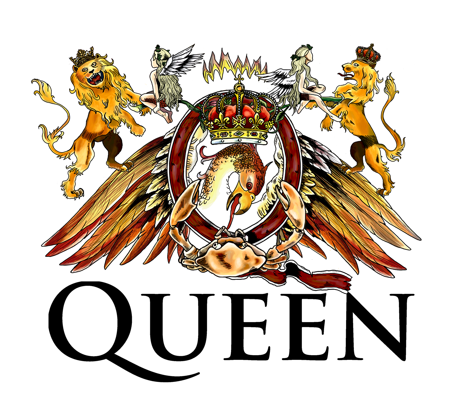
- Meaning and history The Queen’s visual identity is known and loved worldwide, as its badge, created by Freddy Mercury himself, is full of meanings and represents the band’s style, music, and philosophy as nothing else.
- Thought the history of the legendary musicians started a few years before the Queen establishment when the band was called Smile.
- The yellow star was placed on one of the teeth and was complemented by a rounded custom lettering, also in yellow, placed on the upper right and bottom left corners of a black background of the emblem.
- In this version, there is a flame on top of the oval and the large bird was drawn in neat and clean lines.
- This logo was used by the band for only a couple of years, as was redesigned by Mercury in 1975, by adding final touches and a more unique style.
- The “Queen” lettering was now placed under the badge, executed in all capitals letters of a classy and elegant typeface with sharp diagonal serifs.
- The Emblem The Queen emblem was designed by Freddie Mercury himself, as he was a former student of arts and design at Ealing Art College of London.
- The emblem is a very detailed illustration with many hidden symbols.
- It is composed of the zodiac symbols of all the group’s members, the Phoenix bird and the letter “Q” with the crown inside.
- The Phoenix is a symbol of never-ending life, power and passion.
- The Gueen were passionate about music and the style they were performing.
- And the Phoenix is situated on the top part of the emblem.
- The Queen logo resembles the Royal Coat of Arms of England, but its even more regal and impressive.
- The ornate emblem became iconic and is a symbol of the legendary group, created by one of the greatest musicians in history.


Leave a Review