Contents
Quebec Major Jr Hockey League (QMJHL) logo and symbol, meaning, history, PNG
- Download PNG Quebec Major Jr Hockey League Logo PNG Meaning and history 1969 — 1970 The very first logo for the Quebec Major Junior Hockey League was introduced in 1969.
- The badge featured a light sand-gold silhouette of the Quebec province map, enclosed into an elegant dark red uppercase “Q” the thin black stylized monogram was engraved in the middle of the beige contour map element.
- It was a very sophisticated and tender badge, which was pretty difficult to associate with such a brutal kind of sport as hockey.
- 1970 — 1973 The redesign of 1970 made the contours of the elements stronger and thicker, adding some confidence to an elegant badge.
- The color palette was also slightly modified — bringing the lighter shades to both the Quebec Province silhouette (it was now more beige), and to the serif “Q”, which became scarlet red.
- With the new shades, the badge started looking more delightful and energetic.
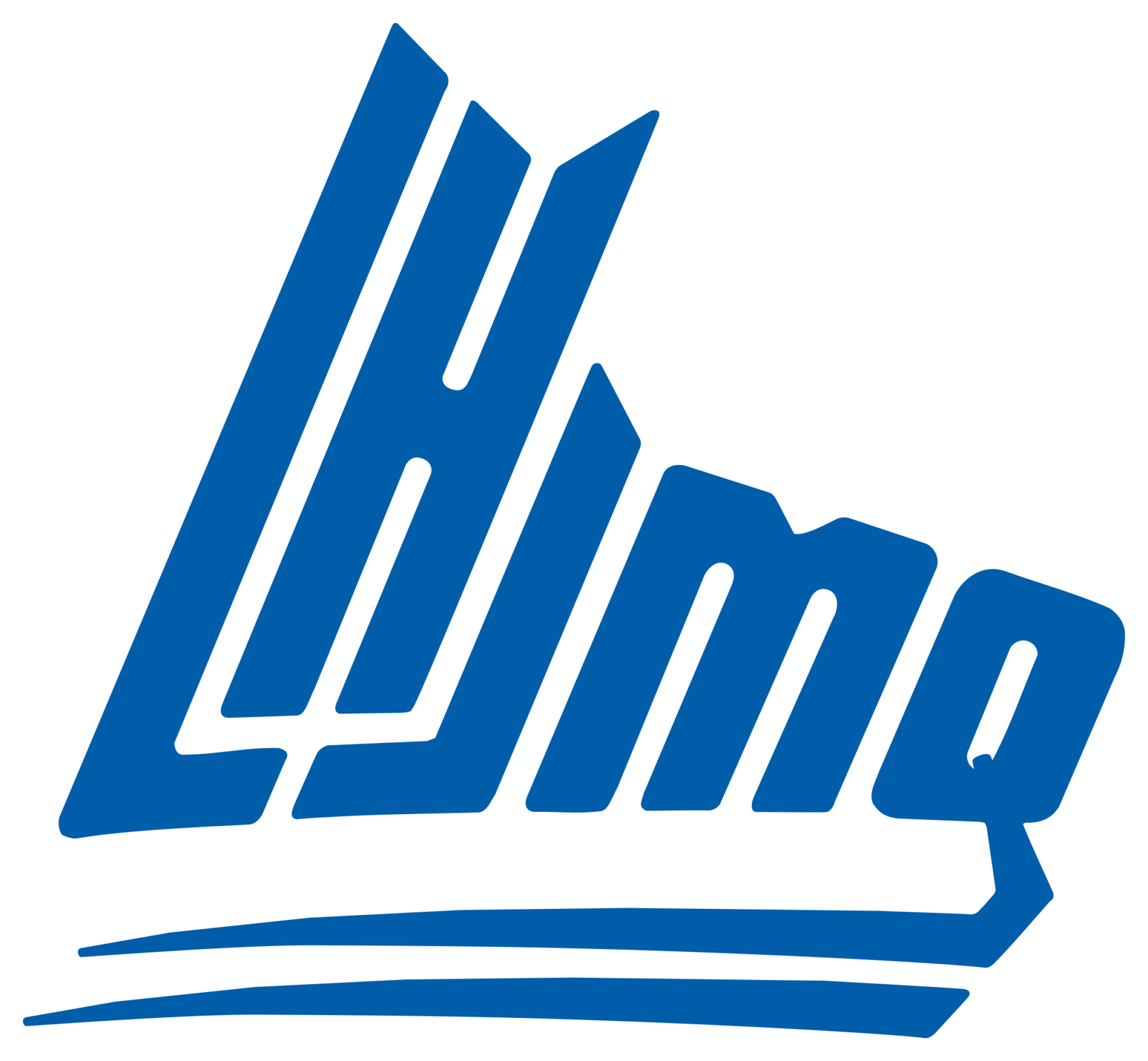
- 1973 — 1978 The old Quebec Major Junior Hockey League logo featured the initial letters of the league’s name in French (LHJMQ).
- The lettering was given in a very unusual and creative script.
- The “L” and the “J” formed hockey sticks facing one another.
- In between, there was a shape bearing a vague resemblance to an “H.” Although this looked like a fresh and unusual design idea, in fact, the emblem was barely legible.
- 1978 — 1994 The new era of the QMJHL visual identity started in 1978 with the design of the new badge.
- The Sans-serif wordmark had the first “L” (resembling a hockey stick) connected to the last “Q” at the bottom part of the badge, creating a bold and strong underline of the whole logotype.
- 1994 — 2020 In the next version of the QMJHL logo, which was unveiled in 1994, the first three letters were made better legible.
- Now the “L” and “J”, placed around the “H”, we’re looking even more like two hockey sticks.








Leave a Review