Quad City Mallards logo and symbol, meaning, history, PNG
- Download PNG Quad City Mallards Logo PNG The Mallards franchise whose logo we are going to describe played in the Quad Cities, Illinois and Iowa, from 2009 to 2018.
- To their fans’ disappointment they ceased operations in 2018 when the season was over.
- The Mallards hockey team that appeared in 2009 as a member of the IHL was named as its predecessor.
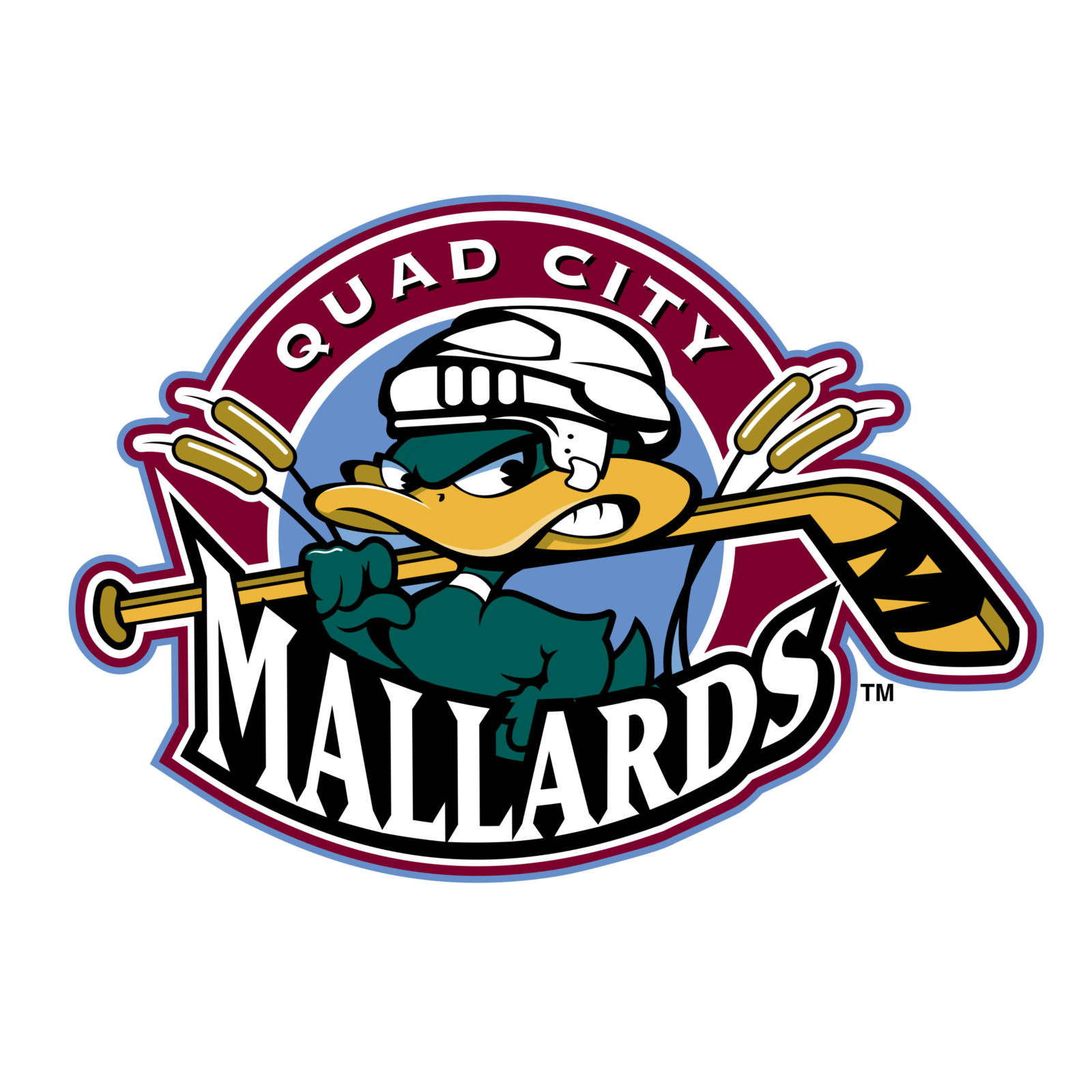
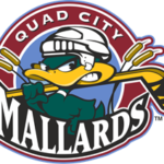
- It was a dark green image of a wild duck (mallard) in a white hockey helmet, and with a yellow and green hockey stick in its yellow beak.
- It was almost the same color palette, with just an addition of light blue and white, but the duck was redrawn and the lettering was placed on the framing of the badge — from the top part.
- As for the bottom line, it changed its color to white and its typeface to a sharper and cleaner one.
- 2005 — 2007 It was a confident and professionally executed badge with a wild duck in a hockey helmet and a stick in its beak placed on a yellow and blue circular background with the bridge on it: the background was outlined in red, and balanced by a red and gray arched inscription, placed above the badge.
- The inscription was executed in a clean and bold sans-serif typeface, with the letters of “Quad-City” featuring a smaller size than the “Mallards” ones.
- The sack was now drawn in smooth lines in several shades of green, white, and orange.
- They used the color scheme of the previous Mallards brand but simplified it.
- The result is a simple color palette (just black, white, green and a bit of orange) which is compensated by a conspicuous design.
- Though it is a new logo, its main characteristic is a strong brand identity.
- Alongside with the color scheme the new Mallards franchise incorporated Mo Mallard, the mascot.
- There are two wordmarks written in white on the black background ‒ “Quad City” (above) and “Mallards” (below).




Leave a Review