Pringles logo and symbol, meaning, history, PNG
- Download PNG Pringles Logo PNG The Pringles logo has had a long history.
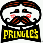
- 1967 – 1980 The original logo was composed of a horizontally stretched rounded man’s portrait executed in bold black lines with red and black striped hair and much rage and circular red cheeks with a white stripes pattern.
- The yellow “Pringle’s” lettering was placed under the portrait on an enlarged solid black bow.
- The typeface of the inscription featured elongated and sharpened serifs and smooth angles.
- 1980 – 1986 1986 – 1996 The name of the brand was changed to “Pringles” in 1986, and the logo of the product was refined in the same year.
- As for the wordmark, its custom and elegant typeface were switched to a more modern and strict geometric sans-serif with solid square shapes.
- The logotype became brighter and cleaner and made the whole logo look fresh, stylish, and confident.
- The logotype was now placed under the images and the bow got smaller and was colored in gradient red, having its thick black outline.
- The mustache man was redrawn in a more contemporary manner and placed on a red and yellow background.
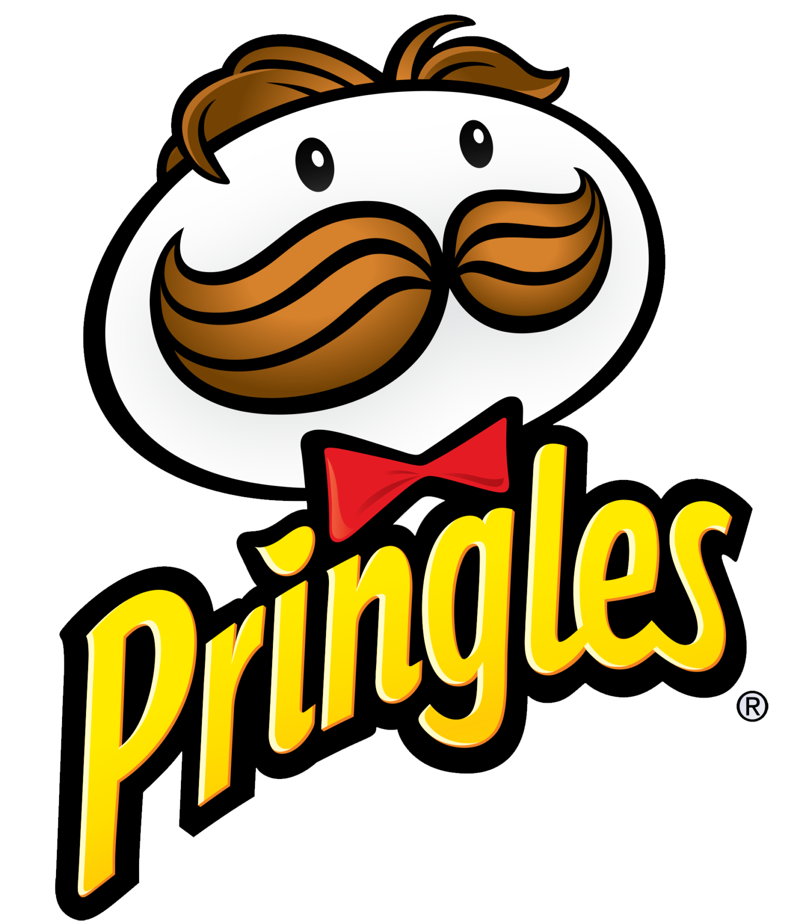
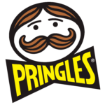
- 2009 – Today 2020 – Today (International) 2020 – Today The current Pringles logo was created in 2009 and is fully based on the previous version, but has its background plain white and the inscription in a new typeface.
- The logotype is now executed in a sleek and smooth sand-serif cursive with elegant rounded shapes and a bold black outline of the gradient yellow letters.
- Font and color The Pringles logo palette consists of 6 colors.
- They are Dirty Brown (#B76E23), Chocolate (#744304), Black (#000000), White (#FFFFFF), Lust (#E51B23) and Middle Yellow (#FFEA00).
- Thanks to red (lust) and yellow the logo attracts attention and keeps it.





Leave a Review