Porto logo and symbol, meaning, history, PNG
- Today the club, nicknamed “Dragons” (which is “Dragōes” in Portuguese) is managed by Jorge Nuno Pinto da Costa and has Sergio Conceiçao as the head coach.
- 1893 — 1910 The very first Porto FC logo was created in 1893, the same year when the club was established.
- 1906 — 1910 The logo, used by the Porto FC from 1906 to 1910 was almost the same as the badge, designed fir the club in 1893, but with the lines of the letters in the monogram slightly emboldened and refined.
- The custom typeface of the letters in the “FCP” monogram looked very creative and made a very interesting image with their bars intertwined.
- As for the colors, the combination of dark blue and white was a great representation of confidence and professionalism of one of the strongest Portuguese football clubs.
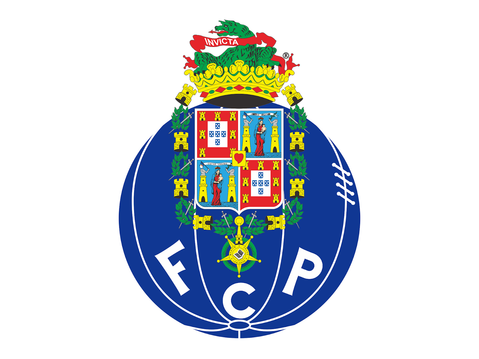
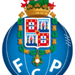
- The blue circle turned into a blue football with white stitched, and a bold white “FCP” let-tering in strict geometric sans-serif on it.
- This logo became a part of the iconic Porto badge we all know today.
- Each letter was placed in a separate segment.
- 1995 — 2002 In 1995 the logo was redrawn in brighter and more vivid colors.
- The dark gold be-came light yellow and the red and blue fragments of the shield were now more visible and detailed.
- 2002 — 2010 The black details were removed from the crest and now the whole logo started looking smoother and more balanced.
- The lettering was changed again, getting en-larged and straightened.
- The crest itself was cleaned and refined, as well as the ball and its white lines and stitches.
- The iconic Porto logo is elegant and bright, it evokes a sense of excellence and au-thority, showing the roots of the club and their fundamental approach to everything they do.





Leave a Review