evolution history and meaning, PNG
- Download PNG Plextor Logo PNG The trademark Plextor was designed for the products of the Division of electronic and printing equipment of the Japanese corporation Plextor Inc., a subsidiary company of Shinano Kenshi Co., Ltd., one of the pioneers of precision electric motor production in Japan.
- The Plextor brand was introduced in 1993; before that, since 1989 it had been known as TEXEL related to the first CD-ROM optical disc drive.
- The intrigue lies in the fact that this brand in 2010 was licensed to a subsidiary of Lite-On Technology Corporation with headquarters in Taipei and since then is considered a Taiwanese brand, while Plextor Inc. uses the trademarks PLEXTALK and PLEXLOGGER for its products.
- Meaning and history The logotype currently used for the brand “Plextor” was developed in 1985 and there have not been introduced any modifications since that time.
- The logo of the brand is formed by the name of the company written in block letters and an emblem situated to the right of the inscription.
- The emblem is a stylized large letter “P”.
- It has a very short stem and a disproportionately large bowl in the form of a regular circle.
- Inside the circle, in its upper-right part, there are three strips in the form of a Crescent.
- These strips give the letter a 3D appearance and create the illusion of great depth, like a hollow pipe going into the distance.
- On the left and bottom side, the letter is inscribed in a square, from which only two stripes are visible: the left and the bottom ones.
- The colour palette of the emblem includes a natural deep green colour, in which the letter “P” is written; blue for the background square and crescents inside the bowl of the letter, and finally, the white background colour inside the bowl of the letter.
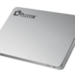
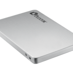
- There are several variations of the Plextor logo which are used depending on the colour of the hardware on which the logo is fixed.
- The second one uses black colour for the letters of the wordmark and the emblem with a silver background.
- There is also a version of the logo with white letters and white emblem on a cobalt blue background.


Leave a Review