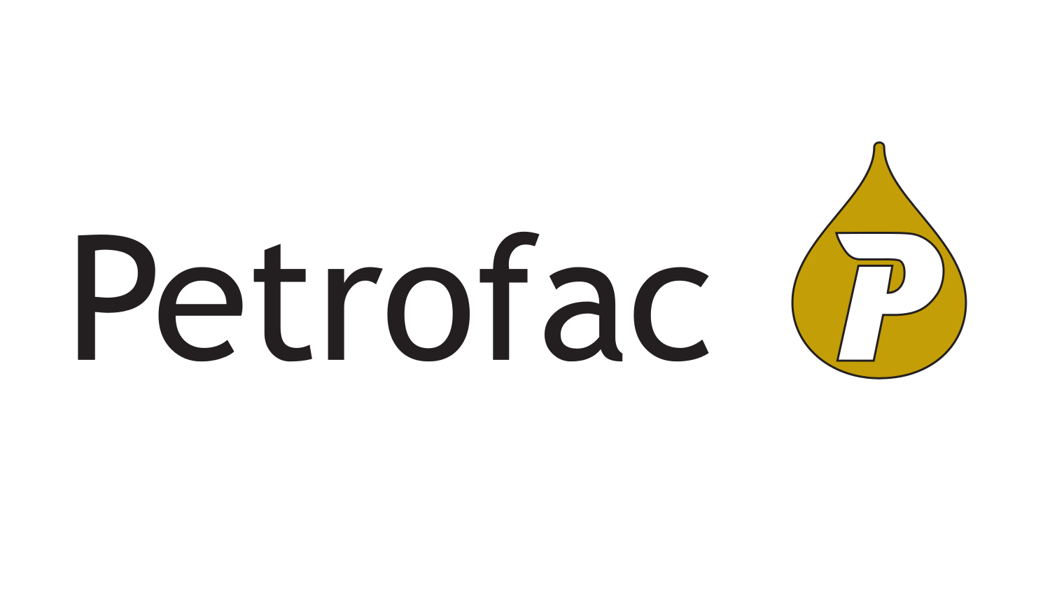
Petrofac logo and symbol, meaning, history, PNG
- Download PNG Petrofac Logo PNG Petrofac is a British provider of oil and gas services, which was organized in 1981 in the USA, and listed on London Stock Exchange in 2005.
- The company operates in more than 20 countries across the globe.
- Meaning and history Petrofac serves the largest petroleum corporations in the world and is known for its professionalism and trustworthiness, the characteristics that are both represented by the brand’s visual identity.
- The black wordmark is executed in a traditional sans-serif typeface with clear confident lines and a lot of space between letters, which makes the logo look light and elegant.
- The Petrofac emblem features an image of the oil drop in brown color, with a white customized letter “P” on it.
- The strict and simple Petrofac logo celebrates the company’s confidence and authority, evoking a sense of reliability and responsibility.
- The company shows itself as a powerful provider, whose main aim is the highest quality of services possible.
- The Petrofac emblem is modest year meaningful, a perfect reflection of the company’s industry segment and serious approach.


Leave a Review