Pepsi logo and symbol, meaning, history, PNG
- Who designed the Pepsi logo?
- The original script logo for Pepsi was created by Caleb Bradham, the company founder, around 1903.
- Now the cursive red lettering with elongated and curved lines was the main and only element of the product’s visual identity.
- It was a bold script lettering in red, with a curved long tail of the letter “C”, and the connected lines of “P” and “C”, underlining the whole logotype and creating a double loop pattern.
- 1906 — 1940 In 1906 the red inscription was refined and the thin delicate “Drink” inscription was added on the upper line of the letter “C”.
- It was an image of the metal bottle cap, colored in red, white, and blue, with the red script lettering from the previous version, placed on the white part of the cap.
- 1962 — 1973 The tricolor cap continued the main theme of the visual identity in 1962 — it was a background for a black bold “Pepsi” inscription in all capitals of the simple sans-serif typeface, with a modified letter “S”.
- 1973 — 1987 The more modern version of the visual identity was designed for the company in 1973.
- The circle with a thick white outline was placed inside a rectangle in a white frame.
- As for the circle, it replicated the pattern of the bottle cap from the previous logos and had a bold blue nameplate placed on its white part.
- The logo was now composed differently — the inscription in too with the red horizontally placed rectangle under it and the circle in red and blue with a thick white curve in the middle, on the right of the rectangle.
- In 1996 additional logo was designed — the white inscription on a blue background, using two different shades to create a geometric pattern.
- The white wordmark in a bold sans-serif typeface with smooth lines and slightly italicized letters featured a thin blue outline and shadow.
- The emblem on this logo was resembling a globe, pointing on the international popularity of the brand.
- 2006 — 2008 The wordmark was placed under the emblem in 2006.
- The iconic “globe” now had the white line placed diagonally and featured a thin double outline, composed of white and blue.
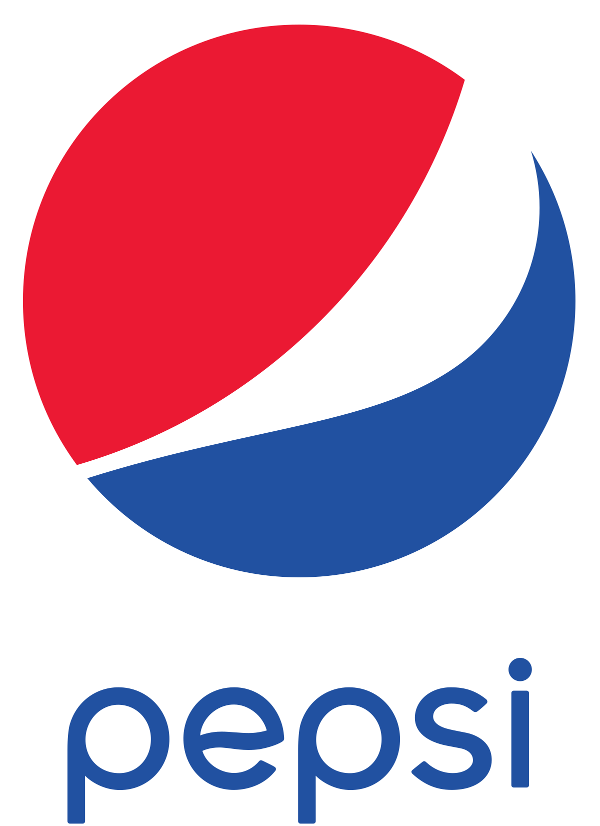
- 2014 — Today The recent insignia of the brand was designed in 2014 and is one of the most minimalist versions in the company’s history.
- The emblem, placed on the left of the wordmark has its frame removed and now looks modern and solid.
- Globe emblem The current Pepsi logo, which is often nicknamed Pepsi Globe, somewhat resembles a smile.
- Being the first manufacturer of soda, Pepsi began its history with a bizarre logo – red color on a white background.


Leave a Review