evolution history and meaning, PNG
- Download PNG Payoneer Logo PNG Payoneer is a web-based company that provides financial services to its clients allowing them to effect transactions of money and to receive payments with the help of re-loadable prepaid MasterCard debit cards.
- Founded in 2005 in New York, nowadays, the Payoneer company renders services to more than 4 million clients in about 200 countries and it has been included in the Inc.5000 guide as one of the top 100 most rapidly developing firms in the area of financial services.
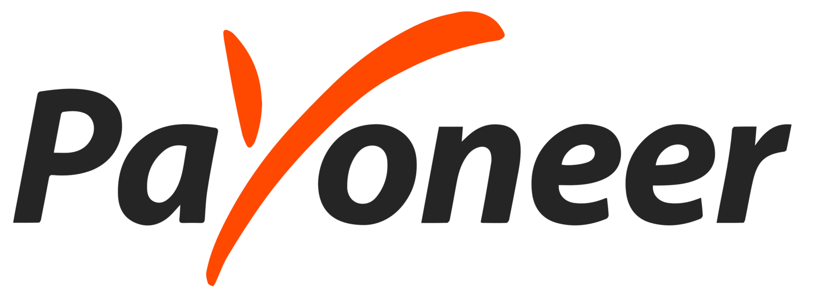
- Meaning and history Before 2021 The logotype of the Payoneer company is most concise and clear.
- The checkmark, which is generally used to indicate the concept of agreement, being put in the place of the letter “Y” in the wordmark symbolized the choice in favour of the Payoneer services made by its clients.
- For numerous users of the Payoneer’s services, its logo means the value of integrity and honesty as well as the removal of the barriers in international commerce, the principles officially declared by the company.
- The colour palette of the logo includes black or dark grey tones for the script of the wordmark with saturated orange for the “Y” checkmark.
- Initially, the letters were put against a chequered rectangle in white and light grey, but nowadays they have a plain white background.
- In another version, all the letters are made in white against a black or an orange background.
- A thumbnail used on smartphones for the Payoneer application is made of concise white “checkmark” in the centre of an orange button.
- 2021 – Today After the redesign of 2021, the visual identity of Payoneer has changed dramatically.
- A completely new style and concept were created for the brand in order to emphasize its professionalism, progressiveness, and loyalty.
- The emblem of the company is a gradient rainbow palette circular outline placed on a plain white background.
- Font and color The title case logotype of Payoneer is executed in a modern simple sans-serif typeface with full-shaped letters and medium-weight lines.
- The closest font to the one, used for the company’s visual identity is Kontora Bold.






Leave a Review