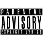
Parental Advisory logo and symbol, meaning, history, PNG
- Download PNG Parental Advisory Logo PNG The official Parental Advisory logo hasn’t changed that much since its introduction in the late 1980s, while the earlier warning labels had a completely different design.
- Its founders were several influential Washington women, including Mary Gore, who later became the Second Lady of the United States.
- The PAL logo was adopted by the Recording Industry Association of America in 1985 and is still not obligatory.
- 1980s – 2001 Before the “Parental Advisory Label Program” actually started working, there existed other versions of warning labels.
- For instance, some music albums were released with a grey circular logotype containing the following text: “Warning.
- The 1990 label read: “Parental Advisory: Explicit Lyrics.” The text was given in three lines.
- The first and the last lines were black with white letters, while the second line contained black lettering on the white background.
- 1994 – Today In 1994, the label was updated.
- Interestingly enough, the labels are called stickers, as originally they were stuck outside of the cases.
- Today, though, they are printed as part of both physical and digital artwork for albums.
- Font The Parental Advisory logo versions vary a lot in terms of typeface.
- Typically, it is a clear, perfectly legible font without any unusual details.
- Color Since 1990, the PAL logo has been featuring only two colors: black and white.
- Some of the earlier warning labels also used other colors (for instance, grey).


Leave a Review