Paralympic Games Logo and symbol, meaning, history, PNG
- The first Paralympic Games took place in 1948 and now the event is being held in the same year and place as the Olympic Games, becoming more and more popular.
- It was pretty much based on the Olympic Games iconic badge, though got its unique personality throughout the years and today be can see as a brilliantly stylish, and individual emblem, which reflects the values of the Paralympic Games and its diversity.
- 1988 — 1994 The emblem, designed for Paralympics in 1988, boasted a bright multicolor structure, composed of five “petals”, which looked more like horizontally placed drops with the thin side curved up.
- Each of the petals had its color, just like on the official logo of the Olympics — blue, black, red, yellow, and green — and the logo was set in two levels, with three elements on top, and two — under them.
- This laconic yet friendly and smooth emblem stayed with Paralympics for ten years.
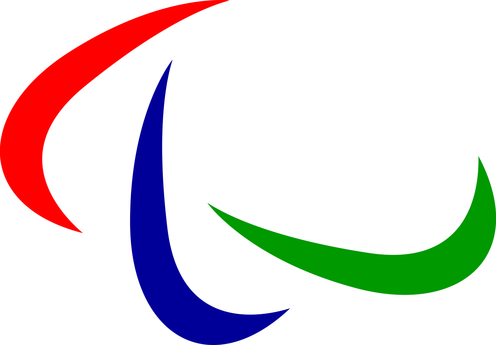
- 2004 — 2019 In 2004 the logo for the world sport event was redrawn again, keeping the color palette of the previous version, but darkening the shades of green, red and blue, making them look more stable and confident.
- The new image was also composed of three elements, though this time they were not petals, arched lines, looking like orbits or swooshes.
- The new logo became a symbol of motion and dynamics, perfectly representing the purpose and spirit of the games.
- The emblem could be used both in color and monochrome versions, and for the International Paralympic Committee, it was accompanied by a three-leveled wordmark, placed under it or an “IPC” abbreviation in black capitals, put in the upper right part of the badge.
- The colors of the elements were brightened up, and the swooshes were placed with more space between them, creating a sense of lightness and freedom.
- Font and color The emblem of Paralympics is usually used without any lettering, or with a simple black sans-serif inscription, pointing to a place and date of the next event.
- The fonts, which are mainly used with the badge, are very traditional and neat ones, just like the typeface of the International Paralympic Committee — similar to FF Megano Pro Black.
- The red, blue, and green color palette has been in use by The Games since 1994, standing for the most popular colors in the national flags of Paralympic participants.
- Though this combination also has a lot of side meanings: red is the color of passion and strength, blue represents protection and reliability, and green symbolized success, growth, and progress.


Leave a Review