Panavision logo and symbol, meaning, history, PNG
- The lenses and cameras of Panavision are used by professionals all over the world.
- Meaning and history The Panavision visual identity looks modern and sleek despite its minimalist design and lack of colors and elements.
- This is a vivid example of “the less the better” and its elegant and chic logo is also very futuristic due to the clean geometric lines.
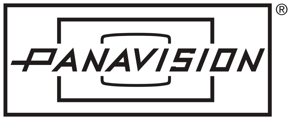
- The logo of the leading motion picture equipment manufacturer is composed of three horizontally stretched rectangles in different sizes, placed once inside another.
- The smallest figure, in the middle of the logo, has its corners rounded and horizontal bars — slightly arched, which makes the whole composition resemble a camera lens.
- It is executed in a custom italicized sans-serif, with stylish geometric lines and an elongated tail of the letter “P”.
- The clean and sharp contours of the lettering balanced the rectangular composition of the logo, making it look progressive and energetic.
- While the italicized font adds delicacy and elegance.


Leave a Review