Orlando Solar Bears logo and symbol, meaning, history, PNG
- Download PNG Orlando Solar Bears Logo PNG The present incarnation of the Orlando Solar Bears has been residing in Orlando, Florida since 2012, the year it was founded.
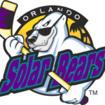
- 1995 — 2001 The very first logo of the Orlando Solar Bears hockey club was created in 1995 and stayed with the team for almost six years.
- It was a bright and friendly badge with the cool polar bear in sunglasses holding a yellow and blue hockey stick and placed on a sunset-orange circular background with a small black palm tree on the right.
- The “Orlando” lettering was written in white capitals arched above the circle, on a black background.
- As for the main logotype, it was executed in a bold and a bit narrowed serif typeface in a title case.
- The letters were intense blue, placed on a green background, and outlined in black.
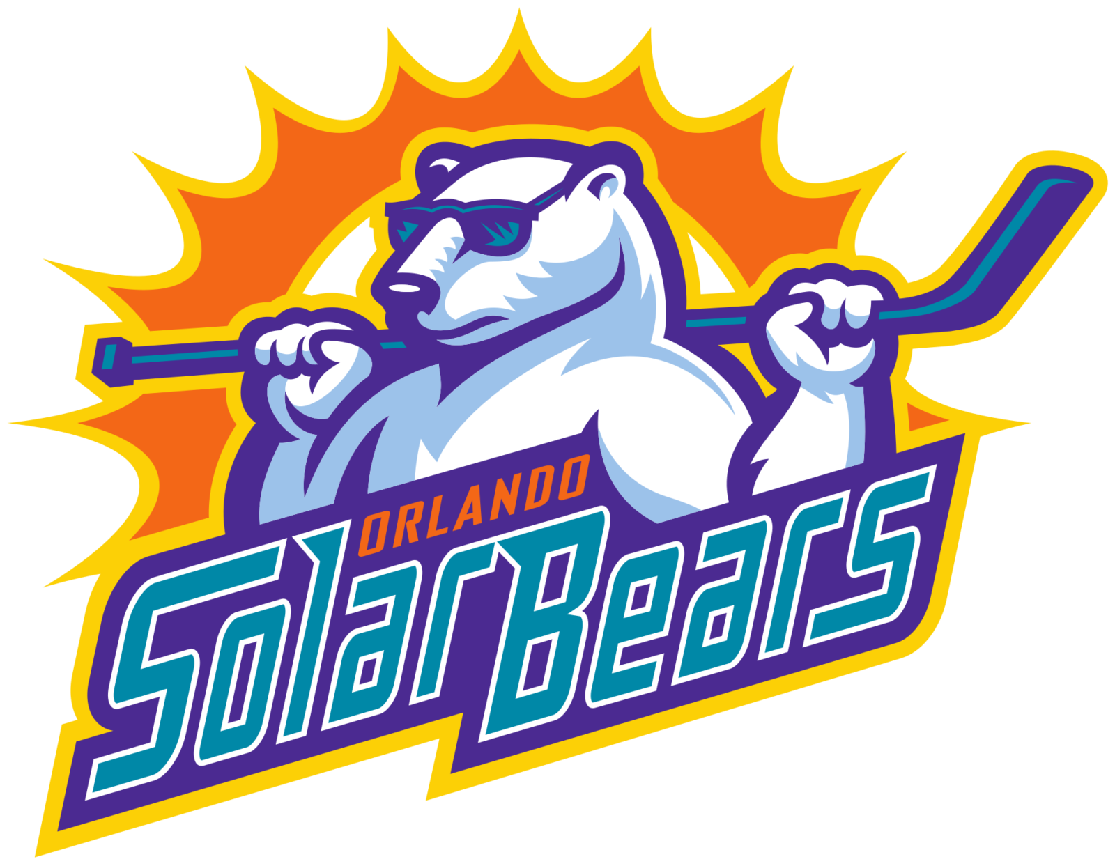
- 2011 — Today If we compare the logo from the 90s and the one designed for the new franchise, we clearly see that the latter is an improved version of the previous one.
- Yet, in the new interpretation the polar bear has a more athletic-looking body as if he spends a lot of time in the gym.
- The new team’s bear is also wearing sunglasses but his pose is different.
- There is the Sun, or rather the stylized letter “O” for Orlando, behind “Shades”.
- The logo is completed with the wordmark “Orlando Solar Bears” below.
- “Orlando” is in orange color and “Solar Bears” is in teal trimmed in sunrise gold.
- Logo Colors Having inherited the name of the hockey team that was based in Orlando from 1995 to 2001, the new franchise also brought back their original colors ‒ teal (they call it seafoam green), solar purple, white and sunset orange.
- But they didn’t stop there and added sunrise gold to the historical color scheme.





Leave a Review