Ogden Raptors logo and symbol, meaning, history, PNG
- Though the Minor League Baseball franchise is an affiliate of the Los Angeles Dodgers, this link isn’t reflected in their logos.
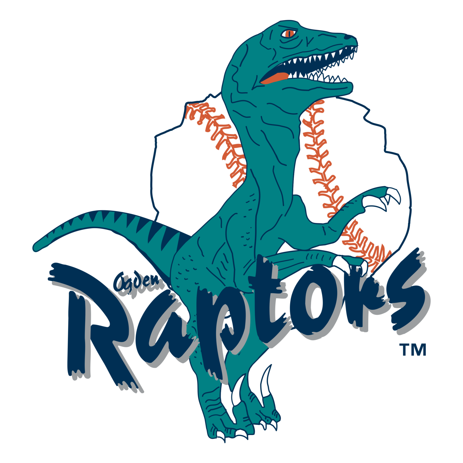
- Meaning and history 1994 — 1999 The Ogden Raptors badge, designed in 1994, stayed with the club for just five years.
- It was a fun and memorable caricature of the dinosaur in turquoise blue, drawn on a background of a baseball with uneven contours.
- The ball is white with a thin black outline and red-stitched looked as if it was made of stone, from the same period as the mascot of the club.
- The lettering was placed diagonally over the bottom half of the logo, written in a custom smooth typeface.
- The contours of the elements were cleaned and strengthened, while the color palette got elevated, gaining darker and chicer shades, which made the whole look of the badge more complete, balanced and professional.
- 2015 — Today The 2015 emblem, which was developed by Jeremy Maxwell of New Era, sports a leaner, sleeker utahraptor.
- While the core of the logo remained the same, the dinosaur changed its position and adopted a more dynamic look.


Leave a Review