evolution history and meaning, PNG
- Download PNG NYX Logo PNG NYX Professional Makeup was established in Los Angeles in 1999.
- The cosmetics brand got its name after Nyx, the Greek goddess of the night.
- Meaning and history The NYX logo can be given in several versions.
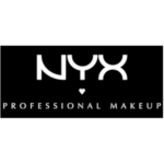
- The simplest wordmark features the word “NYX” in capital letters.
- The glyphs have a distinctive look due to the unusual curves.
- For instance, both the upper and the lower halves of the “X” are formed by two identical semi-circles.
- The same semi-circle is used as the upper half of the “Y,” while the curve replacing the diagonal bar of the “N” echoes the shape, too.
- In the full version of the logo, you can see a small white heart below the “Y.” There is also the tagline “Professional makeup.” Font and color The delicate yet strong and progressive NYX cosmetics logo is based on a black and white badge with two lines of lettering, but more often it is just one line with the brand’s name, written in bold white symbols on a black background.
- The custom NYX inscription is executed in a designed sans-serif typeface with arched lines.
- It was created exclusively for the brand but has some resemblance with Semiramis font.
- As for the “Professional Makeup” tagline, written in the uppercase under the main logotype, it is written in a more elegant and traditional font, close to Optima Std Medium.
- The black and white color palette is a perfect choice for the cosmetic company, as brilliantly accompanied all the creative colors of the label’s products.
- It also looks great on all kinds of packaging, being a timeless and sophisticated combination.


Leave a Review