evolution history and meaning
- Download PNG Nurofen Logo PNG Nurofen is a famous brand of pain-relief medication, which was introduced in 1983.
- The brand was acquired by Reckitt Benckiser in 2005.
- Nurofen is the fastest growing analgesic brand globally.
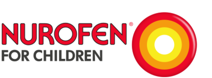
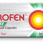
- Meaning and history 1983 – 2005 2005 – 2012 2012 – Today The Nurofen logo is a reflection of brands description “Fast targeted relief from pain”.
- Bright red soft-lined wordmark on a light grey background is complemented by a graphical image of pain – a bright colored circle with a target pattern.
- The red and orange color palette of the circle icon represents pain, which Nurofen fights with.
- The “target” comes through the grey pattern to show the soothing and fast relief from the pain.
- The Nurofen logo is very modern and recognizable, it became iconic in Ontario market segment due to a bold typeface, colors and a perfect graphical representation of the products aim.





Leave a Review