Norfolk Tides logo and symbol, meaning, history, PNG
- Meaning and history While the club’s roots go to 1961, it adopted its current name only in 1993.
- Initially, the team played under the name of the Portsmouth-Norfolk Tides, while its second name was Tidewater Tides (1963–1992).
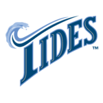
- 1993 — 2015 The Norfolk Tides logo unveiled in 1993 (together with the current name) was based on the word “Tides” positioned diagonally.
- The unusual top “bar” on the letter “T” was designed in the shape of an ocean wave, which gave the otherwise ordinary logo a unique and instantly recognizable look.
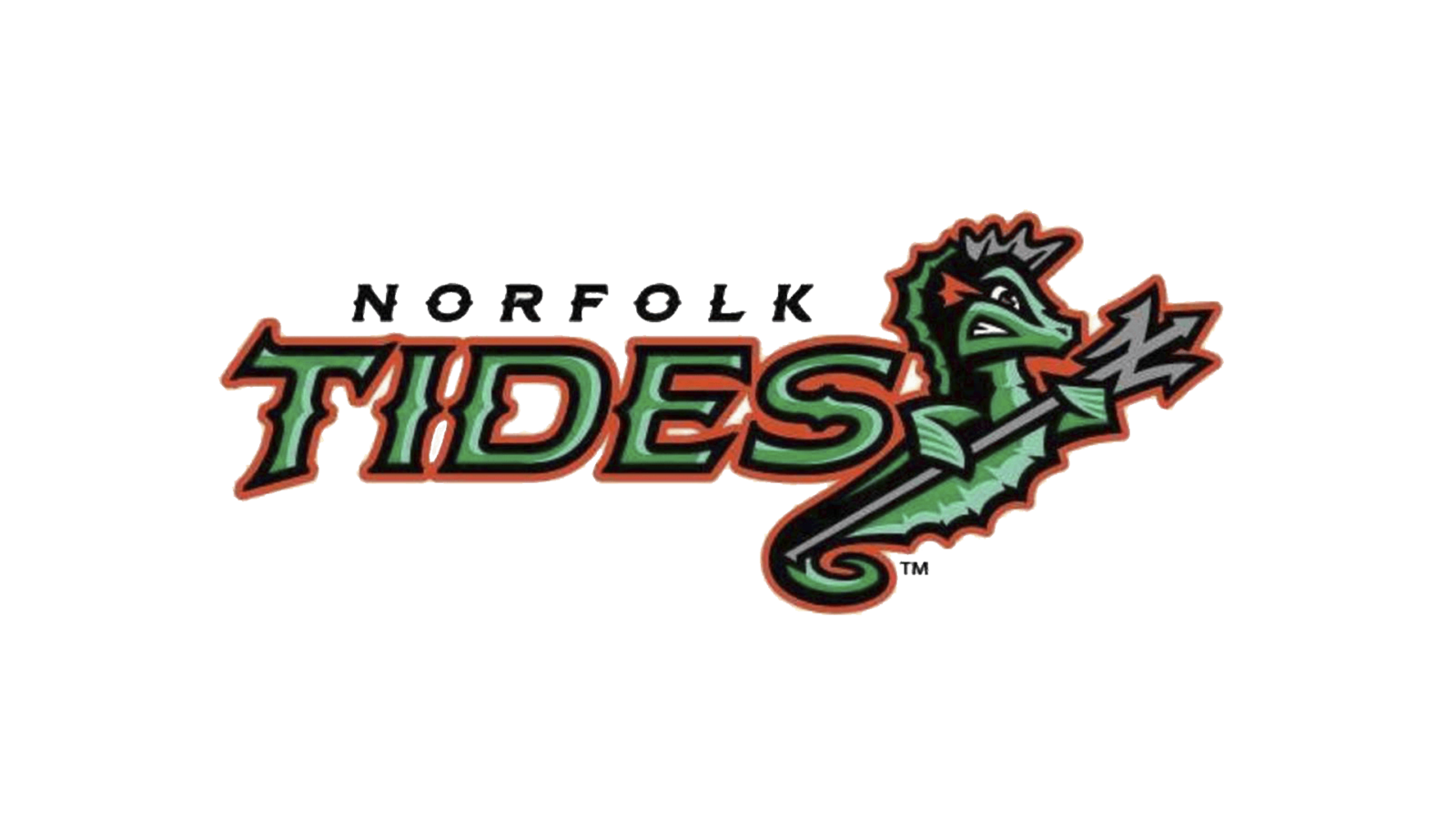
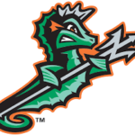
- Now, a green seahorse with a trident is the visual center of the logo.
- The full name of the team is placed to the right.
- There’re two shades of green, which add volume.
- Orange helps to create a contrast, while black and grey provide the finishing touch.





Leave a Review