Nimes Olympique logo and symbol, meaning, history, PNG
- Download PNG Nimes Olympique Logo PNG Nimes Olympique is the name of the French football club, which was established in 1937 in Nimes.
- Meaning and history Since the beginning of the 1970s, the visual identity of the French football club has been pretty consistent in terms of main symbols, structure, and colors.
- The emblem has been more or less the same until 2017, only the shades and contours have been modified from version to version.
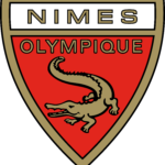
- Executed in red and white, the shield featured a thick gold frame in a delicate black outline, balanced by the team’s symbol image and the wordmark.
- The golden alligator with its mouth open was placed on the bottom part of the logo, featuring solid color and a thin black outline.
- The dangerous and wild animal repre-sents the club as a serious competitor and shows their courage and willingness to win.
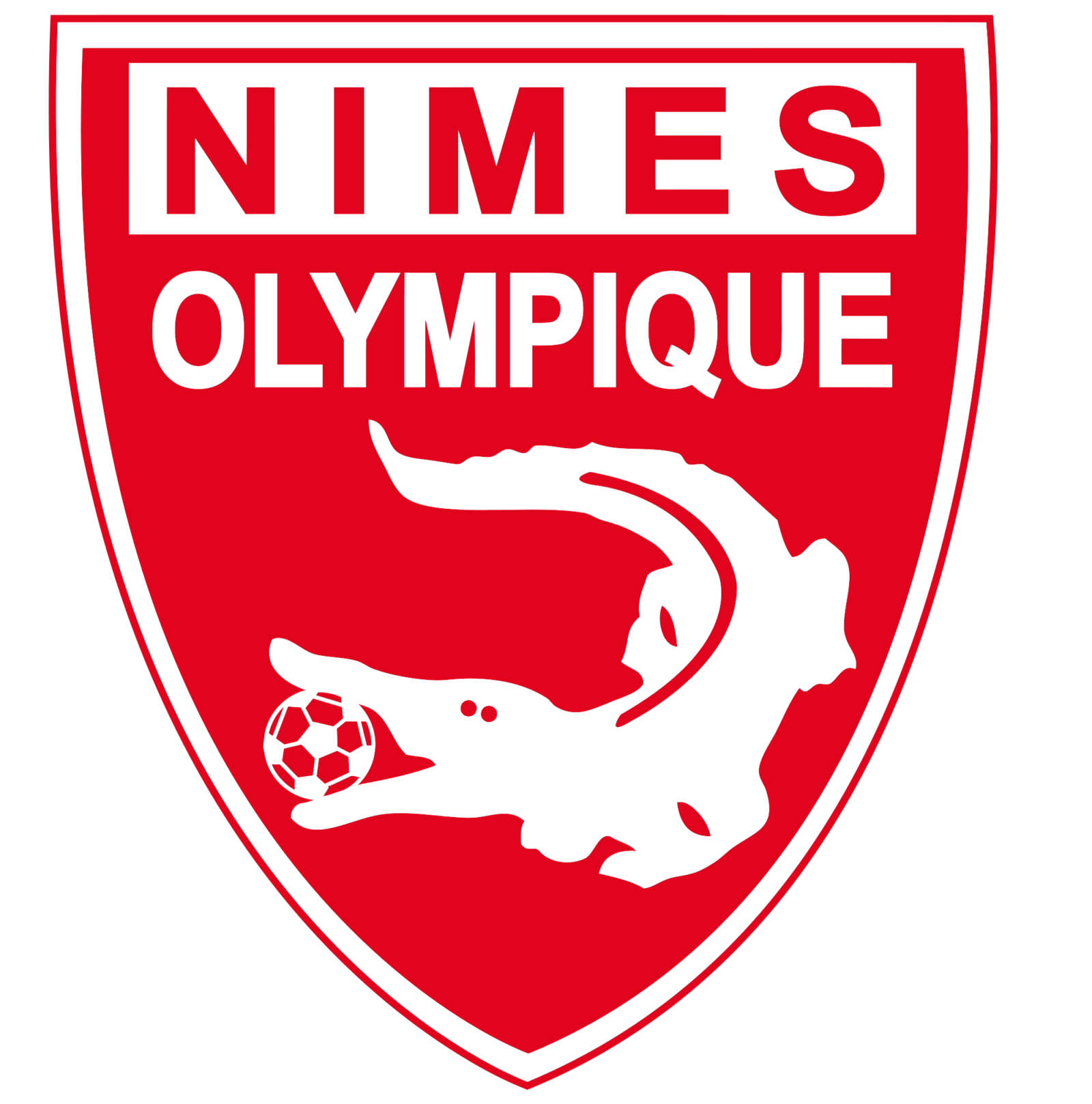
- Now the modern badge is composed of a solid red shield with the white rectangle on its top part.
- As for the symbol, the alligator is colored white and has a football in its mouth.
- The wordmark of the club in traditional geometric sans-serif is split into two levels — the “Nimes” in red is placed in a white rectangle, while the “Olympique” featured white letters on red.
- After a few years, the badge gains a double white and red thin outline and the ball in the creature’s mouth becomes red with white details.
- The football in its mouth is now black and white.
- The wordmark in red is placed on the upper part of the badge, with the “Nimes” in all capitals arched, and “Olympique” placed under it in a straight line.
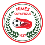
- 2018 — Today The new emblem was created for the French club in 2018.
- The iconic shield is now white in a sleek red outline.




Leave a Review