Newcastle Knights logo and symbol, meaning, history, PNG
- Download PNG Newcastle Knights Logo PNG While the logo of the Newcastle Knights has gone through two updates, the modifications have been quite subtle.
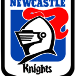
- Meaning and history The original Newcastle Knights logo was based on a shield with a rather thick blue border.
- Inside the shield, there was a side view of a medieval knight’s helmet with a long red hackle.
- The helmet was white with the black border, the hackle was red.
- Inside the shield, you could also see the text “Newcastle” in blue (above the helmet) and “Knights” in black (below the helmet).
- Each of the words featured a different decorative type.
- In the case of the word “Knights,” the letters were ornamental to the point when it damaged legibility.
- The word “Newcastle” was now given in capitals.
- The new badge was cleaner and brighter and featured the knights’ helmet in black and red placed on a white background and accompanied by a two lines inscription under it.
- The upper lines featured a bold blue “Knights” written in the same elegant gothic font with elongated lines as on the previous badge, and the bottom had blue uppercase “Newcastle” in all capitals of a traditional sans-serif font written on it.
- As for the lettering part of the emblem, it was shortened to just one line, “Knights”, which was rewritten in a modern and sharp custom typeface with slightly elongated triangular serifs on some of the letters.
- Font There’re two completely different types on the Newcastle Knights logo.
- The custom font used for the word “Knights” has a medieval feel that fits the name of the team and the helmet design perfectly.
- Colors While the official palette has always been built up of red, blue, and white, there has been some playing around with the shades over the club’s history.






Leave a Review