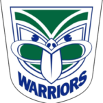
New Zealand Warriors logo and symbol, meaning, history, PNG
- Download PNG New Zealand Warriors Logo PNG The logo of the New Zealand Warriors is one of the most impressive and memorable logos within the National Rugby League.
- It depicts the face of a carved idol.
- Meaning and history 1995 — 1999 The earliest New Zealand Warriors logo was developed by Francis Allan of Colenso.
- The design showcased the tekoteko’s face.
- The word “tekoteko” is a Māori term for the a carved human form.
- 2000 — 2001 In 2000, when the Tainui tribe and ex-Kiwi coach Graham Lowe took over the club, the emblem was slightly altered: the tongue of the tiki was straightened.
- This move was made because, in the Māori culture, a curved tongue was an indicator of a curse (it symbolized physical weakness).
- 2002 — 2020 A more obvious modification took place in 2002 when the combination of white, blue, and green was replaced by silver and black.
- 2019 In advance of its 20th season, the club introduced a color split logo (half of the face featured the old palette, while the other half featured the gray and black color scheme).
- For the 25th season (2019), the team returned to a logo with the original color scheme and the lettering “25th season Warriors.” 2020 — Today The redesign of 2020 kept the main part of the Warriors’ visual identity untouched, leaving the fancy mask as it was and its bright green, white and blue color palette unchanged.
- The “Warriors” wordmark is still arched under the badge but is now written in solid blue letters of a slightly narrowed sans-serif typeface with a strong character.
- Colors During its first years, the club used blue, white, red, and green as its official colors.
- In 2002, the team colors changed to black and gray.
- This modification was reflected on the New Zealand Warriors logo, too.


Leave a Review