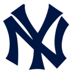
New York Yankees logo and symbol, meaning, history, PNG
- Meaning and history One of the most popular baseball teams in the world, and definitely the most famous New York sports club, the New York Yankees was established in 1901 under the name Baltimore Highlanders.
- Their first two logos were the modest representations of the original name, and only in 1903, the legendary NY monogram appeared.
- Two interlocking letters were first introduced in 1905 but didn’t stay for long and were replaced by another emblem, though came back in 1909 and stayed until today.
- For almost a year the iconic baseball club was called Baltimore Orioles and has a simple and modest logo — an orange letter “O” placed on a black background.
- 1903 — 1905 New York Highlanders appeared in 1903 along with the new logo.
- Two ornate letters “NY” were executed in blue and placed on a white background.
- 1905 — 1906 The first version of interlocking letters was created in 1905.
- This design didn’t last long and already in a year the team comes back to two letters with a wide space between them.
- 1906 — 1907 The logo from 1906 has more distinct and confident contours than the previous versions.
- 1907 — 1908 In 1907 the letters of the logo became thinner and the blue cane back to the original dark shade, which looks professional and powerful.
- 1909 — 1912 The prototype of the current logo was designed in 1909, basing on the version from 1905.
- 1913 — Today The team got the name New York Yankees in 1913 and the logo was slightly redesigned.
- The most popular version, used on prints and websites, has the letters’ edges slightly arched, looking stylish and sleek.
- 1946 — 1967 The official emblem of the iconic baseball team was designed in 1946 by Lon Keller and changed only once, in 1968.
- The emblem depicts a white baseball with a thick red outline and stitched.
- The contours of the lettering are cleaner and more distinct now and the whole image looks powerful and confident, just as the emblem of the most recognizable baseball team in the world has to be.
- Symbol Before the club got its current name and symbol (in 1913 and 1909 respectively), it was called New York Highlanders and used variations of a stylized “N” and “Y” as its logo.
- Alternative emblems There are three versions of the New York Yankees logo, each used for a different purpose: the cap logo, where both the characters have the same proportions the emblem that can be seen on the club’s home jersey: “Y” is a bit larger in comparison to “N”, while the curves are more emphasized the print Yankees symbol, where both the letters have slightly emphasized serifs Font The iconic “NY” initials feature customized font.
- Color The letters are navy blue, while the background is white.
- In addition to these two colors, the club’s official color palette also features grey.





Leave a Review