Contents
New Hampshire Fisher Cats logo and symbol, meaning, history, PNG
- Download PNG New Hampshire Fisher Cats Logo PNG The team started its history in 1993 as the New Haven Ravens.
- Today, they compete in the Eastern League and are affiliated with the Toronto Blue Jays.
- Meaning and history 2004 — 2007 The main character of the earliest New Hampshire Fisher Cats logo (2004) is a brown fisher cat (there’re a lot of them all over New Hampshire).
- The cat is holding a bat and ball and has its mouth open showing sharp fangs.
- There’s a forest on the background.
- The emblem was developed by Studio Simon.
- While the forest disappeared from the logo, it left a lot of green elements as a replacement.
- According to Brenner, the color shift of 2011 was meant to introduce patriotic motives brought about by the colors of the US flag.
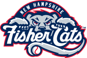
- 2011 — Today The New Hampshire Fisher Cats logo was redesigned in 2011.
- The only charge that was made — the color palette of the badge.
- All elements remained untouched, the cat’s head above the inscription in the same typeface as on the logo from 2008, and a long curved tail of the animal as the underline of the wordmark.
- The color palette now features three main shades — dark blue, light gray, and intense red for outlines.
- The badge looks fresh and cool.
- Colors Navy blue, red, grey, and white are all incorporated into the New Hampshire Fisher Cats logo.







Leave a Review