Nelvana logo and symbol, meaning, history, PNG
- Download PNG Nelvana Logo PNG Nelvana Enterprises, Inc. is an animation studio and children’s media company.
- It is headquartered in Toronto, Ontario, Canada.
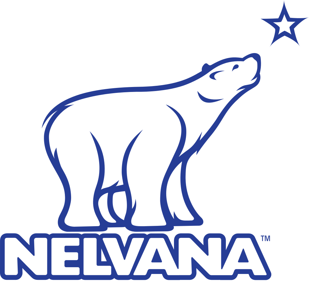
- While the Nelvana logo has been updated more than seven times, it has always preserved its core: a polar bear looking up.
- The stars were arched above the bear.
- Below, you could see the word “Nelvana” in a simple yet legible sans serif type.
- 1995 (first version) Once again, only the bear was left on the logo.
- It looked pretty much like the original emblem, with the exception of very subtle differences and the blue color.
- Here, the stars were white.
- 1999 – 2005 The lettering grew larger, which made it better legible.
- Now, there was a single large star (the North Star), so the emblem became easier to grasp.
- The letters were heavier than in the previous version.
- Both the picture and the type are based on a circle shape.
- The bear, which has been redrawn from scratch once again, echoes the shape of the glyphs due to the bold strokes.
- Video





Leave a Review