Nebraska-Omaha Mavericks Logo
- Meaning and history 1997 The logo for Nebraska Omaha Mavericks, designed in 1997, featured an ornate and a bit aggressive badge with the red and black bull image “covered” with a stylized “Mavericks” inscription in thick red letters with a thin black outline.
- The main lettering was set in a black background and accompanied by a white uppercase “University of Nebraska Omaha” wordmark above it.
- 2004 The redesign of 2004 refined the lines of all the logo elements, making them look stronger and more professional.
- The black background of the “Mavericks” was removed and now both the wordmark and the emblem were set on white, which added more balance to the image, showing the confidence and willingness of the teams to win.
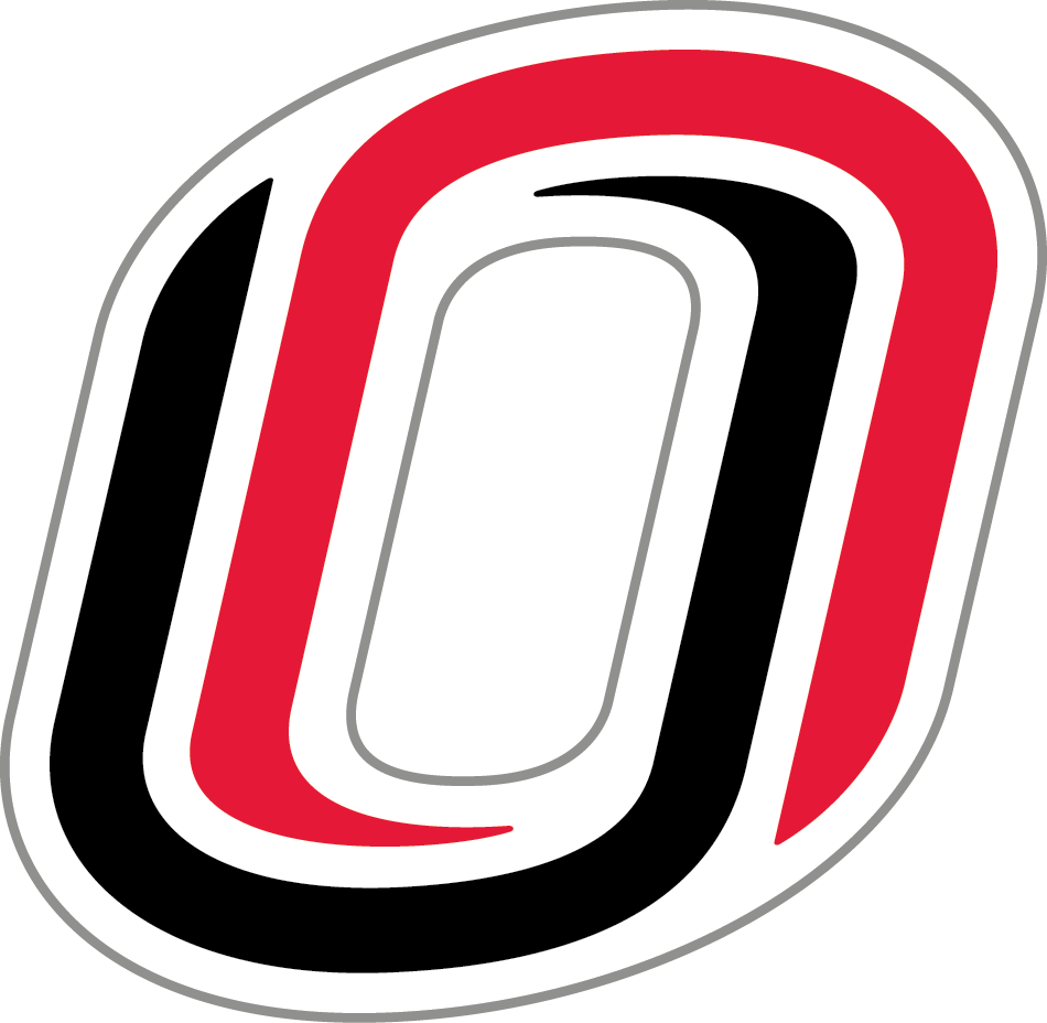
- 2011 – Today The Nebraska-Omaha Mavericks logo is pretty abstract.
- It consists of two partly overlapping letters “O.” One of them is given in red, while the other is black.
- You can also see a white “O” in the negative space.
- This emblem was introduced in 2011.


Leave a Review