Nashville Sounds logo and symbol, meaning, history, PNG
- Download PNG Nashville Sounds Logo PNG The baseball club was established around 1976.
- It got its name after the so-called “Nashville sound,” a type of country music that was born in the area in the middle of the 20th century.
- Meaning and history 1998 — 2014 The 1998 Nashville Sounds logo shows a player who has just hit a baseball.
- There’s actually only the black outline of the player, while behind his back the Nashville skyline, also in black, can be seen.
- Placed over the orange background, it has a slightly romantic sunset feel.
- The logo has an oval shape, with the word “Sounds” in red positioned on the forefront.
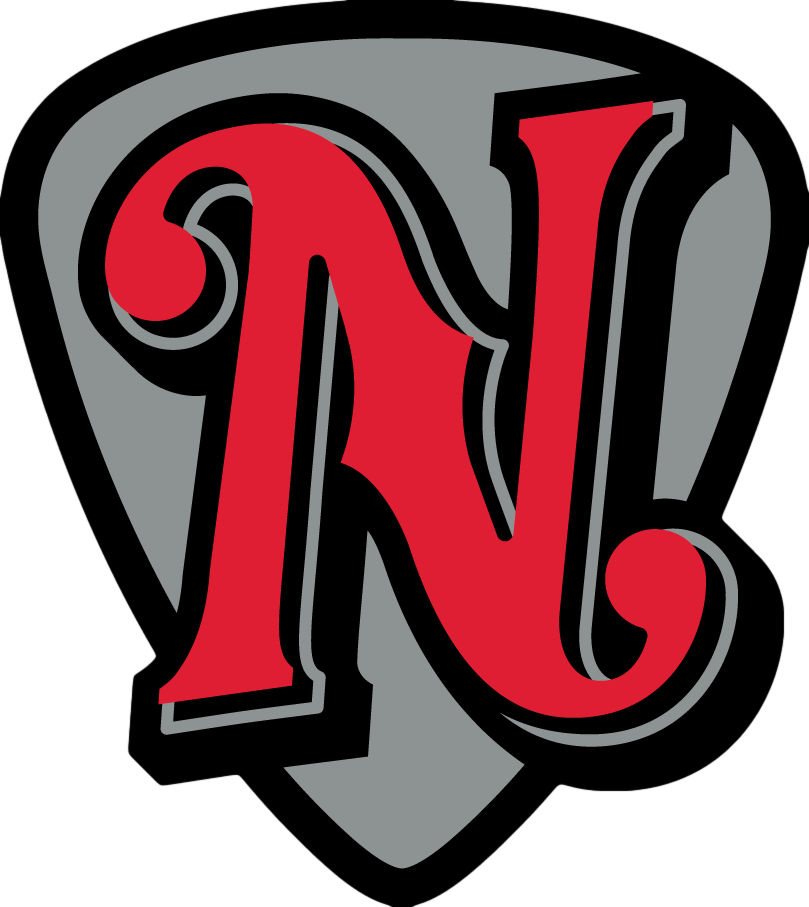
- 2015 — 2018 In 2015, a logo with a large red “N” over a grey shield was introduced.
- Interestingly enough, while the Nashville Sounds logo doesn’t copy any element from the emblem of the parent team, the “N” is somewhat reminiscent in style of the “A” from the Oakland Athletics logo.
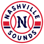
- 2019 — Today The Nashville Sounds visual identity created in 2019 boasts a bright and fresh circular badge in white, blue, and Ted color palette, which is the most patriotic one.
- The main color of the emblem is white, and the circle featured a central part, stylized as a baseball with a red outline, where the custom blue letter “N” is placed, and the “Nashville Sounds” lettering in the uppercase century placed around the perimeter.
- The inscription is separated by thick red and blue lines, which add recognizability and memorability to the logo.
- Colors Unlike many other affiliate teams, the Nashville Sounds created an absolutely independent palette (red, black, and platinum silver).
- Not a single color has been borrowed from the logo of their parent team.




Leave a Review