Nashville Predators logo and symbol, meaning, history, PNG
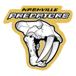
- Download PNG Nashville Predators Logo PNG The Nashville Predators logo features a side view of the saber-toothed tiger in blue and gold against the white background.
- Meaning and history In 1995, rumors spread among sports fans in Nashville that the New Jersey Devils would move there, to the Nashville Arena, which was being constructed at the time.
- However, the attempt to bring the Devils to Nashville failed, while the arena opened the following years.
- When it turned out that the club wouldn’t move, either, Nashville went after a hockey team.
- 1998 — 2011 The most interesting thing in the Nashville Predators logo history is probably that the logo actually appeared before the team.
- Shortly after the city got an expansion franchise in 1997, the owners unveiled an emblem, which looked rather unusual for a hockey logo.
- Eventually, Craig Leipold suggested his own version, “Predators.” This very version won during the final vote.
- There have also been a couple of minor alterations in the shape of the elements.
- For instance, the pupil in the creature’s eye has become more distinct.
- This emblem is featured on the Nashville Predators uniforms.
- One of them features a navy blue badge with three blue stars in a yellow circle and the letters “N” and “P” below.
- The team also used the skull of the saber-toothed tiger as its secondary logo.
- Back in 1971, construction works started on UBS Tower, one of the city’s most impressive buildings.
- Colors The current Nashville Predators logo comprises three colors: blue (#011840), white (#ffffff), and yellow (#ffb915).The original emblem consisted of six colors, including red and two shades of grey.


Leave a Review