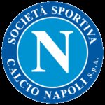
Napoli logo and symbol, meaning, history, PNG
- Since then, the team has gone through almost ten logotypes.
- The Napoli FC logo has almost always been a large “N” inside a light blue circle, the color probably inspired by the waters of the Gulf of Naples.
- Meaning and history 1926 — 1927 The first logo Napoli adopted featured a prancing horse on a ball inside a blue ellipse.
- This symbol, which was fundamentally different from all the following emblems, survived only a year.
- All the light elements of the logo were outlines in thin black for better contrast and visibility.
- 1964 — 1980 The redesign of 1964 kept the concept of the previous badge, but made it more modern and strong, rewriting the “N” in a custom and sharp font and emboldening the golden frame of the blue circle.
- The logo was accompanied by the “S.
- 1980 — 2002 The color palette of the logo, designed for the club in 1980, was built on two shades of blue and white.
- It was a solid light blue circle with a bold white letter “N” in a strong and clean serif typeface on it.
- Instead of the framing, the medallion was enclosed into a “Societa Sportiva Calcio Napoli” inscription, written in all capitals of a traditional serif font around the perimeter, in dark blue.
- The middle part with the white letter “N” remained untouched, while the framing became thick and blue, with the inscription turning white and the “S.
- 2004 — 2006 The lines of the badge were strengthened, cleaned, and refined in 2004, and this is also when the inscription was shortened to just “Napoli Soccer”, which was written along the bottom part of the circular frame of the Napoli badge.
- 2006 — Today The redesign of 2006 introduced a modernized version of the blue and white Napoli emblem, with no additional lettering around its perimeter.
- Now the bold “N” and the thin inner outline of a smaller circle were the only white elements of the badge.


Leave a Review