Monmouth Hawks Logo
- Download PNG Monmouth Hawks Logo PNG The 23 varsity teams sponsored by Monmouth University in West Long Branch, New Jersey, compete under the name of the Monmouth Hawks.
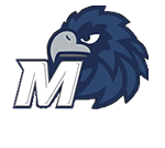
- Meaning and history 1993 – 2004 The stylized hawk has been featured on the Monmouth Hawks logo since at least 1993.
- On the older logo, the bird’s head was shown above the capital “M” given in a vivid shade of blue.
- 2005 – 2013 In 2005, the crest was redrawn.
- Now, the bird had a different mood and was shown in the middle of the game.
- The shade of blue grew calmer, softer.
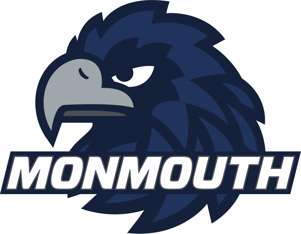
- 2014 – Today In 2014, the emblem went through a complete overhaul.
- Now, the hawk’s beak is more visible, which makes the emotion depicted on the Monmouth Hawks logo more apparent.
- The word “Monmouth” in white is written across the bird.
- Monmouth Hawks baseball The baseball team has made four NCAA Tournament appearances (the latest in 2009).
- The Hawks have made a total of seven NCAA Tournament appearances (at different levels) the latest of them in 2006.
- The women’s team has made a single NCAA Division I Tournament appearance (in 1983).
- They became the Conference Tournament Champions in 1987.
- Monmouth Hawks Colors MIDNIGHT BLUE PANTONE: PMS 282 C HEX COLOR: #041E42; RGB: (4, 30, 66) CMYK: (100, 90, 13, 68) GREY PANTONE: PMS COOL GREY 11 C HEX COLOR: #53565A; RGB: (83, 86, 90) CMYK: (44, 34, 22, 77) WHITE PANTONE: P 1-1 C HEX COLOR: #FFFFFF; RGB: (255, 255, 255) CMYK: (0, 0, 0, 0)




Leave a Review