Mirinda Logo and symbol, meaning, history, PNG
- 1959 — 1970 The very first logo for Mirinda was created in 1959 and stayed with the brand for more than ten years.
- 1970 — 1986 The redesign of 1970 brought the orange components to the logo, and now it was playful and bright.
- The new delightful emblem of the brand featured a solid orange with a white and yellow outline and a stylized green uppercase lettering horizontally set on it.
- The color of the inscription was balanced by the leaves in the fruit, and the solidness of the orange was brilliantly accompanied by the smoothness and thickness of the letter lines.
- 1986 — 1992 In 1986 the logo was simplified.
- All the additional contouring lines were removed and the inscription, which was now executed in a stricter sans-serif font and used a darker shade of green for its letters, was set on a white background, which “cut” the circular orange into two parts horizontally.
- 1992 — 1995 The redesign of 1992 refined the contours of the emblem and the logotype and placed it diagonally on a bright gradient orange background with yellow diagonal lines coming through the whole image.
- The lettering was now set in a traditional font with distinct cuts, and the lines of its narrowed green letters were outlined in thick white.
- The “Orange” tagline in green handwritten cursive was added under the main inscription.
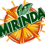
- 1995 — 2001 With the redesign of 1995, the Mirinda logo became cleaner and more modern.
- The orange splashes were added around the fruit, which made it look like it was cut in two halves.
- Two green leaves were now placed not above the orange, but the letter “I”.
- 2001 — 2004 The redesign of 2001 introduced another version of the Mirinda visual identity.
- It was built around the same elements, but this time drawn in brush blurred lines, which had rounded ends and looked very artsy and welcoming.
- The delightful yellow-shadow was added to the emblem to make it more visual rather than on a solid orange background.
- The uppercase letters of the logo were all jumping, which added playfulness and friendliness to the image of the brand.
- The color palette was changed to gradient green, which looked good on a new background — a circle, framed by green leaves from the top and bottom parts, and with a gradient orange and yellow middle, resembling a summer sunset.
- 2012 — 2017 The redesign of 2012 introduced smooth rounded lettering in calm green with the letters outlined in white and green and diagonally arched on a stylized image, with the bottom part showing the fruit, and the upper — yellow and green splashes, standing for taste, refreshment, and the essence of the brand.
- 2017 — Today In 2017 the Mirinda visual identity goes through another refinement.
- Now the official version of the brand’s visual identity features only a stylized green logotype set on a white background, which can be changed to an orange one depending on the needs.






Leave a Review