Minnesota Vikings logo and symbol, meaning, history, PNG
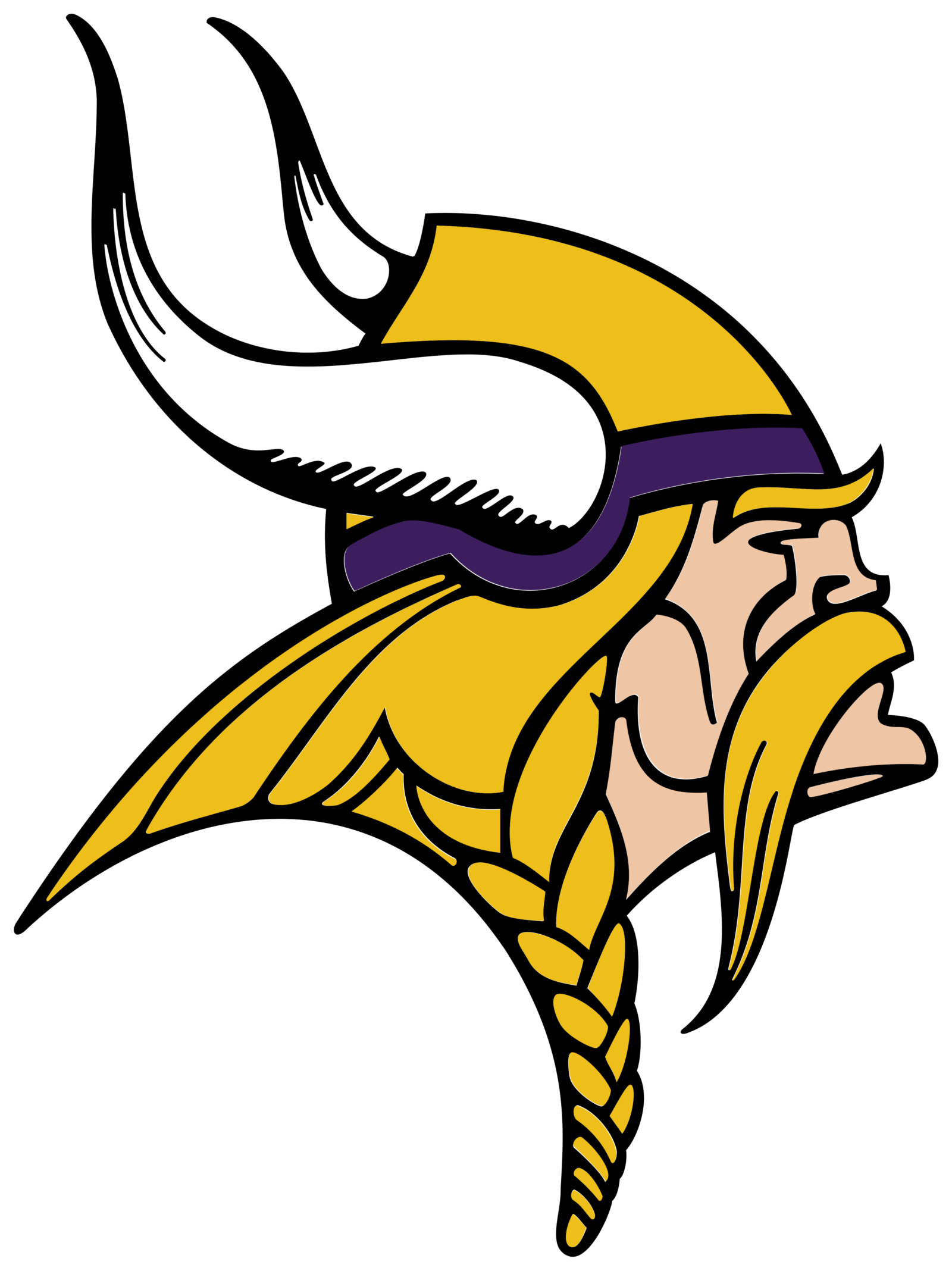
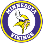
- Download PNG Minnesota Vikings Logo PNG All the three versions of Minnesota Vikings logo may look rather similar as all of them feature the same Norseman.
- And yet, if you compare them side-by-side, the differences between them become obvious.
- Meaning and history The strong and sharp logo of Minnesota Viking was created at the beginning of the 1960s and has arrived in the 2000s with almost no major changes.
- By today the emblem was redesigned only twice, keeping the main theme and color palette of the initial version barely touched.
- 1961 — 1965 The initial logo for the football club from Minnesota was introduced in 1961 and featured a white and yellow portrait of a Viking in profile.
- The man with yellow hair and helmet was facing left and has its face with an elongated mustache in white.
- The horn on the Viking’s helmet was elongated and pointing upright, creating a sense of progress and motion.
- 1966 — 2012 The redesign of 1966 changed the direction of the emblem and the Viking got turned to the right, looking into the future, being ready to step in and fight.
- The color palette of the logo was also switched and now the face of the man gained a light-beige skin tone, and the mustache became yellow, the same color the Viking’s hair and helmet were colored in.
- The horns on the helmet were now colored white, which gave a better balance to the whole image.
- The head and the horn became a bit smaller; white the hair and the bottom line of the image was slightly stretched horizontally, which made h the e logo look more progressive and gave a sense of movement and energy to the club’s visual identity.
- As for the color palette — it stays the same, as was on the previous version.
- Font The letters “M” and “V” look unique due to the unusual shape of the script.
- Color The original combination of white, black, and yellow (nicknamed Vikings Gold) was enriched with purple in 1966 and has stayed like this until now.




Leave a Review