Minnesota Intercollegiate Athletic Conference Logo
- Download PNG Minnesota Intercollegiate Athletic Conference Logo PNG Meaning and history 2002 – 2012 In the previous version, there were two parts: the abbreviation over the black background and a burning torch.
- The emblem used in 2000-2012 featured both the map and the torch.
- There was also a rather complex design in the background, which made the logo look cluttered.
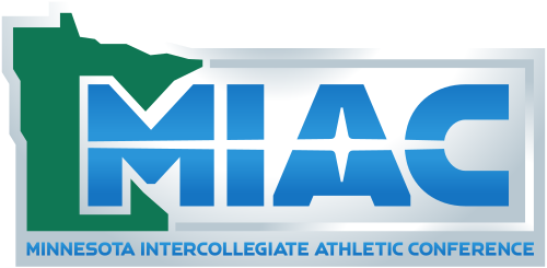
- 2013 – Today In the current version, you can see the lettering “MIAC” in a futuristic style.
- A white highlight goes across the middle of the blue letters breaking each of them down into two parts.
- The “A” has an unusual elongated hole.
- In the background, there is a green map of the state of Minnesota.






Leave a Review