Minecraft logo and symbol, meaning, history, PNG
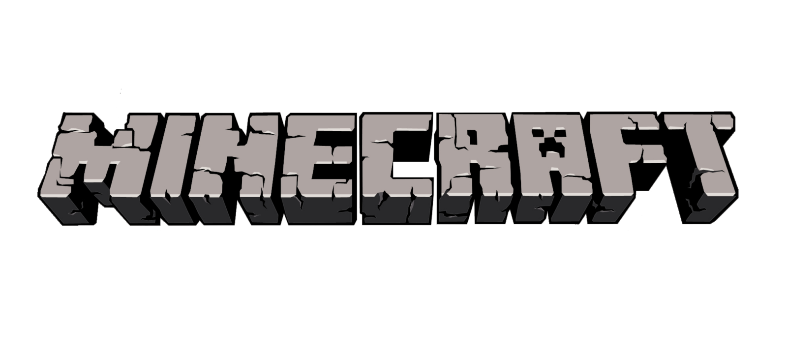
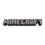
- The current logo of the brand is pretty simple in shapes and color palette, though still instantly recognizable among games from all over the globe.
- 2009 The very first logo for Minecraft was created by Hayden Scott-Baron in 2009, but it has never been used by the brand.
- The gray color of the surface stood for the cobblestone, and the same pattern was used for the game itself.
- 2011 – 2015 The Minecraft logo was redesigned in 2011, with its letters being thickened and pattern — refined.
- The color palette of the emblem was still composed of gray and black, but gray on this version was solid and had some thin black cracks on it.
- 2012 – Today The logo of the video game was refined in 2012, by adding some gradient shades to its gray color palette.
- The contours of the symbols were emboldened and cleaned and the face of the “A” became more visible.
- Also, special logos have been introduced for the Bedrock Edition and Java Edition.
- They are basically the same, except for a couple of minor details.
- Icon There are two options for the Minecraft Icon used by the famous online gaming portal.
- The first one is a three-dimensional cube, executed in a green and brown color palette, with a pixel-checkered pattern.
- The second version of the icon is mainly used on iOS and is executed in the same brown and green color palette with the pixel pattern, but this time it is a flat square image with a gradient white and gray three-dimensional “Minecraft” wordmark in all capitals, placed in the middle line of the square.
- Font The wordmark has been created from scratch, so we can’t talk about a ready-made font, in this case.
- The type was inspired by the main wordmark and has a complete set of glyphs.




Leave a Review