Milwaukee Brewers logo and symbol, meaning, history, PNG
- Download PNG Milwaukee Brewers Logo PNG The baseball team Milwaukee Brewers has gone through several logotypes, the 1978 version being probably the most well-known of them.
- 1969 The logo for Seattle Pilots, created in 1969, only stayed with the club for several months, until its relocation to Milwaukee and changing the name to Brewers.
- The blue “Pilots” inscription in the lowercase was placed in the center of the white ball and executed in a bold italicized sans-serif.
- 1970 — 1977 The first logo, created for the club after its relocation, featured a funny and cool caricature of a baseball player with a bat, executed in the white, blue, and yellow palette, which reflected energy, professionalism, progressive approach, and sense of humor of the club.
- 1978 — 1993 The redesign of 1978 introduced a new Milwaukee Brewers emblem, consisting of a stylized fist, formed by two lowercase letters, “M” and “B”, with the negative space of the “B” with a white and yellow ball in it.
- The main color of the new badge was bright blue, which looked delightful and dynamic in a yellow outline.
- 1994 — 1999 After more than a decade of using the previous logo, the club decided to bring something new to its visual identity and represents a strict geometric badge in 1994.
- The new color palette of the logo looked professional and chic, evoking a sense of creativity and success.
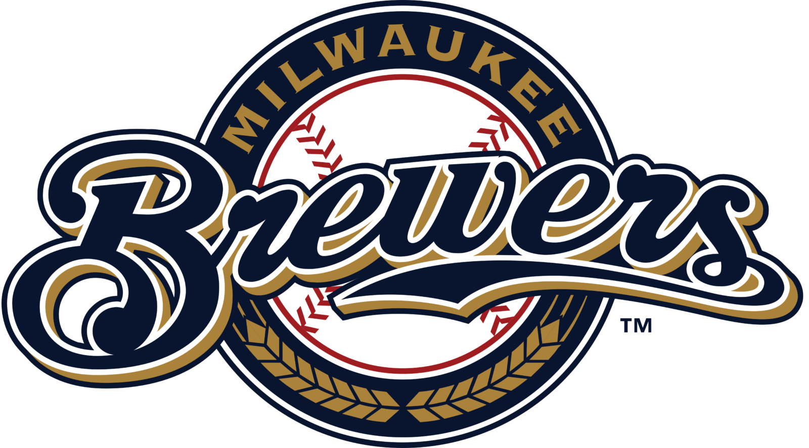
- It was a traditional circular badge with a white and Ted baseball in the center and a white blue and gold frame with the wordmark around its perimeter.
- The enlarged script “Brewers” inscription was written in blue and gold and placed over the emblem.
- 2018 — 2019 In 2018 Milwaukee Brewers start using their secondary emblem, created in 2000, as the primary one.
- It was a smooth and chic letter “M” with its upper bar curbed, executed in royal blue and outline in white, with a delicate golden shadow.
- The “M” was underlined by a gold ear in a blue outline, which was a graphical representation of the club’s names and its symbol.
- Font The wordmark “Brewers” features a unique custom script, while the lettering “Milwaukee” above is made in a traditional sans serif font.





Leave a Review