Milwaukee Admirals logo and symbol, meaning, history, PNG
- Download PNG Milwaukee Admirals Logo PNG The American Hockey League team Milwaukee Admirals is the affiliate of the NHL’s Nashville Predators.
- The Milwaukee club has gone through a series of logos throughout its more than 50-year history, each new logo being scarier and scarier.
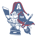
- Meaning and history 1977 — 1981 The original Milwaukee Admirals logo, which was introduced in advance of the 1977/78 season, featured quite a friendly and fun guy in a military uniform and with his hat over his eyes.
- The guy was holding a hockey stick.
- He was wearing a saber.
- 1997 — 2001 In 1997, a logo with only the admiral’s head and the name of the team was adopted, which was replaced by a skeleton’s head logo in 2006.
- 2001 — 2006 In 2001 the Admirals logo was slightly refined, making the contours of all elements cleaner and neater.
- The graphical part of the emblem became a bit smaller, which created a better balance between the admiral’s head and the burgundy wordmark.
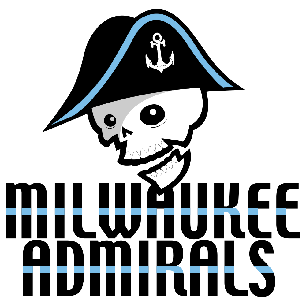
- 2006 — 2015 In 2006 the Milwaukee Admiral’s visual identity was completely redrawn.
- The admiral’s head was replaced by the skull in a black and blue head with the white anchor on it.
- As for the inscription, it was also redrawn in a custom narrowed typeface with all the letters in the same size and a new color palette — black with a light blue stripe coming through the middle of the wordmark.
- The new insignia of the sports club features a blue and white color palette, a fancy custom inscription, and an image of the admiral with the skull replacing his face.
- The logo looks professional and aggressive, brilliantly reflecting the spirit of the team.
- Video





Leave a Review