Midwest Conference Logo
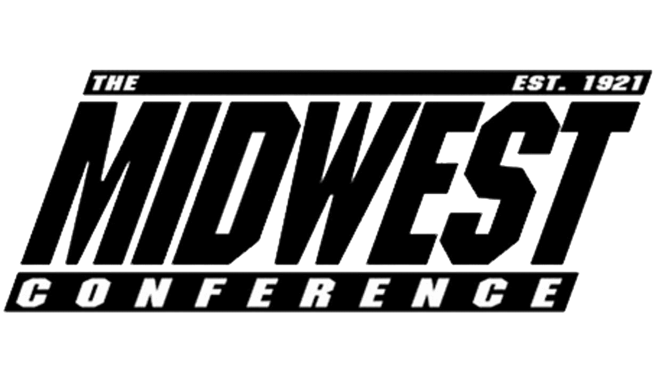
- Download PNG Midwest Conference Log PNG While the Midwest Conference logo is very simple, it is also dynamic and has a sporty feel.
- It appears slightly cluttered, though.
- Meaning and history The emblem is dominated by the lettering “Midwest” given in black sans serif letters.
- If there was a bit more space between the glyphs and they were not so bold, the word would be better legible.
- The italicized type adds some motion.
- Below, there is the word “Conference” in smaller letters.
- At the top, you can see the text “the” and “est.
- 1921.” While the basic logo is black-and-white, it can change its background color, thus getting some diversity from year to year.





Leave a Review