Mid-American Conference Logo
- Download PNG Mid-American Conference Logo PNG Meaning and history 2000 – 2007 The Mid American Conference logo, created in 2000, stayed with the association for seven years.
- It was a circular emblem in green and orange, with white and black lettering on it.
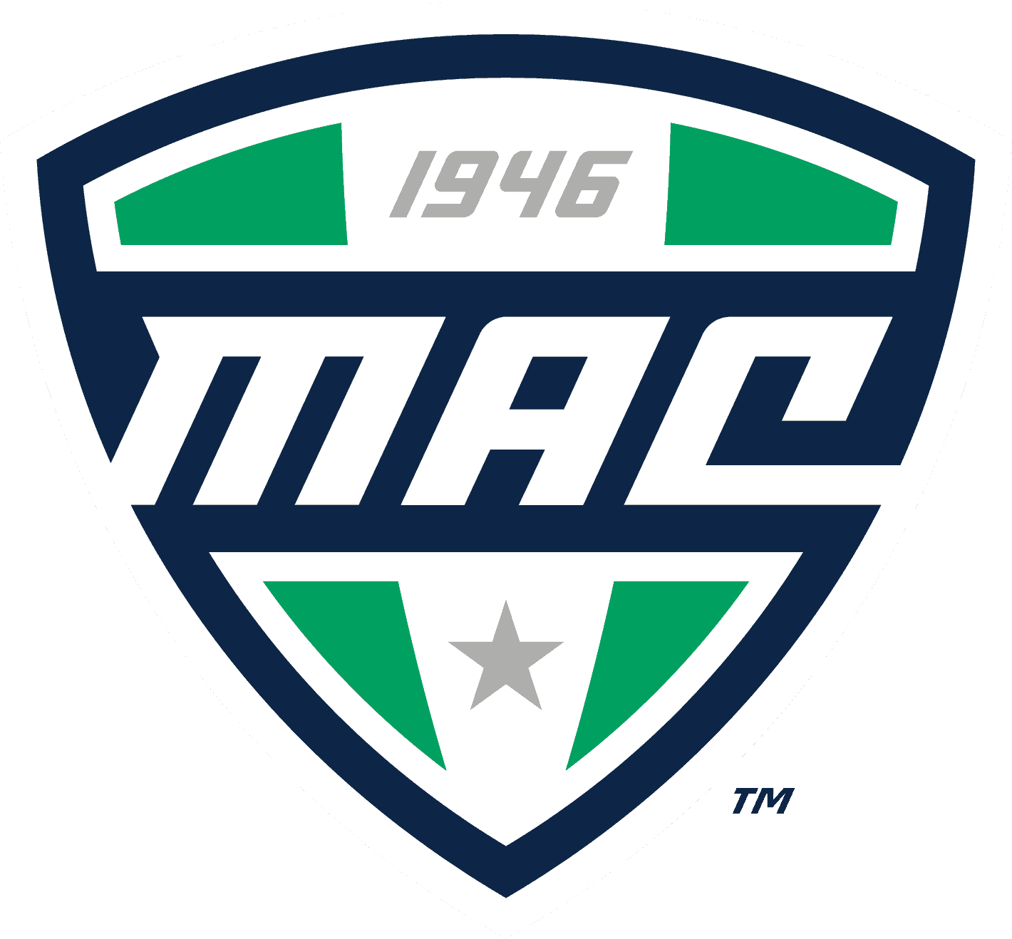
- 2008 – Today The redesign of 2008 completely changed the style and shape of the MaC badge.
- The new color palette consists of white, green, and blue, the colors standing for growth, development, and confidence.
- The crest is vertically divided into three segments — two green and one white in the center.
- The “MAC” lettering is written in white on a dark blue horizontal banner.
- The crest is complemented by a dark blue inscription under it.
- It is set in the same typeface, as the white monogram on the blue banner.





Leave a Review