Mickey Mouse Clubhouse logo and symbol, meaning, history, PNG
- Download PNG Mickey Mouse Clubhouse Logo PNG Mickey Mouse Clubhouse is the name of the educational series about the world’s most famous animated character.
- The show was launched in 2006 and has more than 120 episodes created by today.
- Each episode lasts 30 minutes and has a separate topic.
- Meaning and history 2005 2006 – 2016 As everything Mickey Mouse-related, the Clubhouse’s logo is bright, fun, and playful.
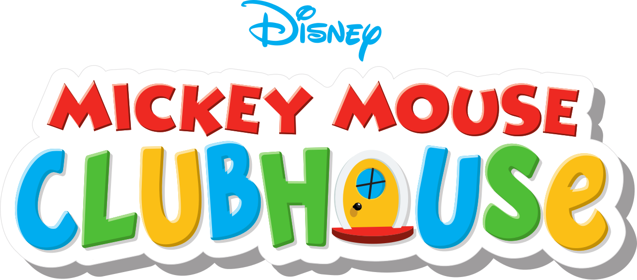
- Composed of a wordmark in two completely different styles, the emblem features only one graphical element, and it is placed right into the inscription.
- Of course, the iconic Disney nameplate is also here, to show the affiliation of the project to the world’s most famous children entertainment company.
- The logo is built in three levels — the upper one, with the “Disney” inscription in their corporate style, drawn in light blue.
- The middle level contains the “Mickey Mouse” lettering, executed in a bold geometric sans-serif, with red as the main and black for the outline.
- This is the official logotype of the world’s most popular mouse.
- And the third, bottom, level, where the “Clubhouse” nameplate is placed.
- The “Clubhouse” part is written in a bold sans-serif with its letters placed uneven, in order to give them the “jumping”, vivid look.
- The letter is colored in blue, green, and yellow, and the “O” is replaced by a yellow door, which is supposed to lead you into the new world of knowledge and entertainment.
- The logo of the series is usually placed on a white badge, which repeats the contours of the lettering and is located on a sky-blue background, so it resembles a fluffy cloud in the sky.





Leave a Review