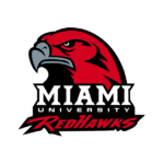
Miami (Ohio) RedHawks logo and symbol, meaning, history, PNG
- The RedHawks are a member of the Mid-American Conference.
- Meaning and history 1979 While the older Miami (Ohio) RedHawks logo featured a Native American, the university later refused from the Indian symbolism.
- 1997 In 1996, the program was officially renamed the RedHawks.
- The same year, they adopted a Miami (Ohio) RedHawks logo featuring an angled view of the hawk’s head.
- 2014 – Today The redesign of 2014 introduced a refreshed and elevated Red Hawks visual identity, with the o key element — a sharp and modern letter “M” with elongated bars and pointed ends.
- The letter is executed in a dark and intense shade of red and outlined in thick black, fully repeating the red contours of the character.
- The new emblem looks powerful and evoked a sense of energy and determination.
- Miami (Ohio) RedHawks ice hockey During their years in the Central Collegiate Hockey Association, the schools claimed to have had one of the most successful ice hockey teams in the league.
- Miami University is proud of its Goggin Ice Center, which is used as the home arena.
- Miami (Ohio) RedHawks football The university’s football team is among America’s oldest.
- It started play in 1888.
- What is Miami Ohio RedHawks?
- Miami Ohio RedHawks is the name of the university athletic program from the Miami University in Ohio.
- Miami (Ohio) RedHawks Colors RED PANTONE: PMS 186 C HEX COLOR: #B61E2E; RGB: (200, 16, 46) CMYK: (0, 100, 81, 4) BLACK PANTONE: PMS BLACK 6 C HEX COLOR: #000000; RGB: (0,0,0) CMYK: (0,0,0,100) WHITE PANTONE: P 1-1 C HEX COLOR: #FFFFFF; RGB: (255, 255, 255) CMYK: (0, 0, 0, 0)”





Leave a Review