Miami Marlins logo and symbol, meaning, history, PNG
- It has been playing in Major League Baseball since 1993.
- For about 20 years the club was known as the Florida Marlins and used an emblem based on the image of the marlin fish.
- In 2012 it adopted a new logo, following the team’s rebranding as the Miami Marlins.
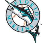
- 1993 — 2011 The original logo of the club boasted a light and fresh badge, composed of an image of a marlin’s in black, sea-blue, and white, piercing a circular frame, where the wordmark was written around the perimeter.
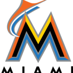
- 2012 — 2016 The club changed its name to Miami Marlins in 2012 and introduced its new logo in the same year.
- The color palette of the new badge consisted of orange, blue; yellow, and black and was balanced by a minimalist and solid “Miami” lettering placed under it.
- The alternate version of the logo had its orange elements replaced by red ones.
- 2017 — 2018 The redesign of 2017 replaced the black elements of the logo with the white ones, removed the “Miami” lettering, and made the light gray outline of the “M” and the “Marlin” a bit wider and more visible.
- The emblem was fresh and delightful and evokes a sense of speed, energy, and joy.
- The light and bright “M” was removed and now the black and blue marlin became the main element of the badge.
- It is drawn in a sleek modern shape with sharp lines and the perfect balance of colors.
- The “Miami” wordmark got back to the logo, but now it is executed in a smooth custom cursive with some tails sharpened.
- Color According to Jeffrey Loria, who owns the club, the current palette reflects the colors of Miami, the colors of sunsets and the ocean.
- Video


Leave a Review