Miami Dolphins logo and symbol, meaning, history, PNG
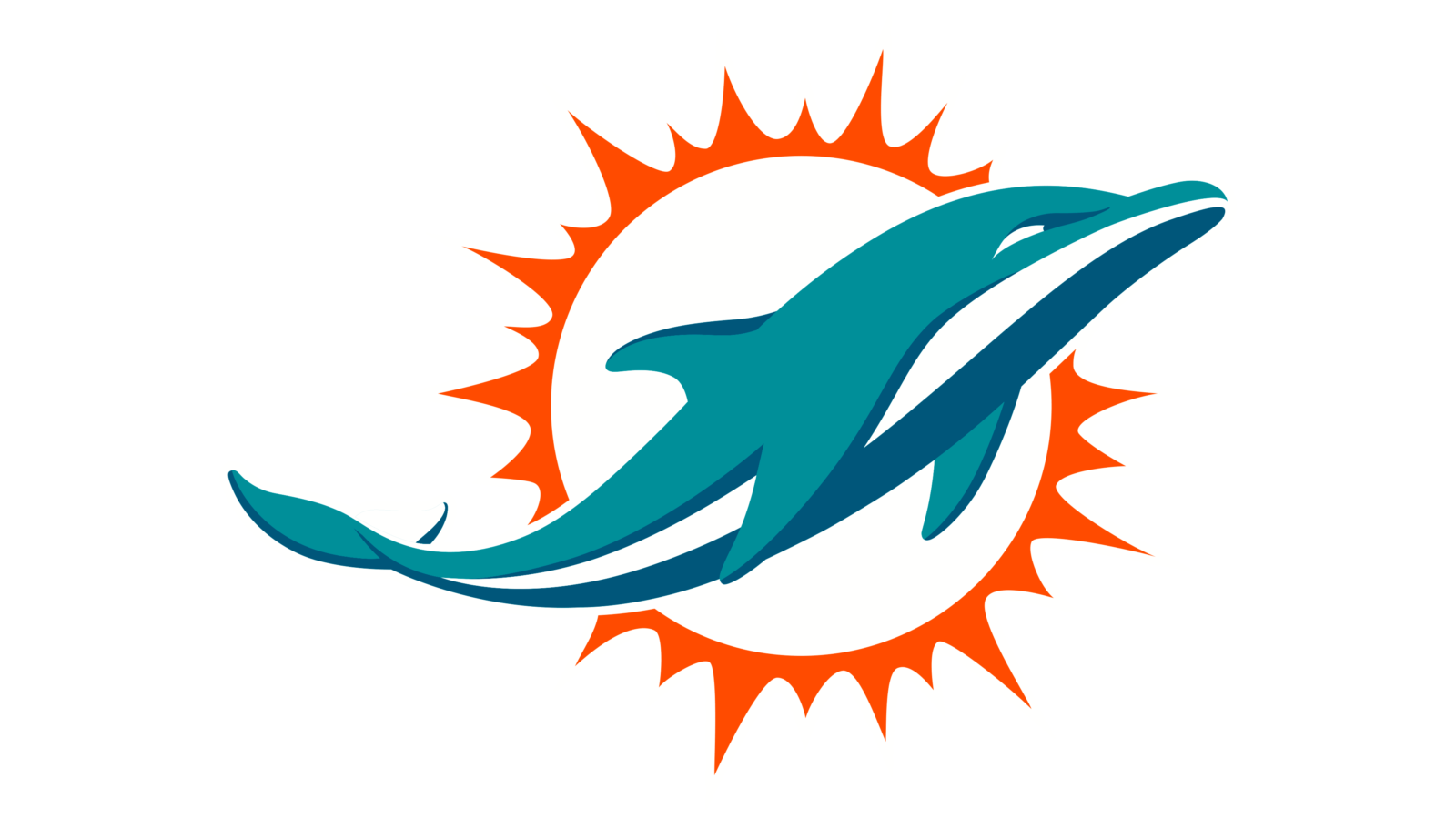
- Download PNG Miami Dolphins Logo PNG Ever since its introduction in 1966, the Miami Dolphins logo has been using the same symbols: a teal dolphin and an orange circle representing the sun.
- Meaning and history Miami Dolphins is one of the football clubs with a strong value of its roots and heritage, thus it still uses a modified version of its original logo, keeping two main elements and the bright and remarkable color palette as they were created, just having their contours modernized.
- 1966 — 1974 The initial emblem for Miami Dolphins featured a large white sun with an orange ring with numerous rays around it, and a friendly smiling dolphin in a white and orange football helmet, placed vertically over the abstract sun.
- 1974 — 1979 In 1974 the logo was slightly refined by enlarging the dolphin’s figure and its helmet.
- Now the white helm with blue and orange stripes had the serif orange “M” placed on it more distinct and visible.
- The contours of the sun rays were also cleaned and lines — elongated.
- The color palette was elevated by making orange deeper and darker, and the turquoise shade with more green tone.
- The orange “M” on a white helmet changed its typeface and was now bolder and more massive than on the previous version.
- The face of the mascot was now more detailed, as well as the helmet on its head.
- Though it is fully based on the original version, the contours of both the sun disk and the dolphin were cleaned and modernized to represent the progress and growth of the club, and add a contemporary touch to its visual identity.
- The dolphin was now drawn without any helmet and featured a turquoise, blue and white palette, while the sunburst had some of its lines elongated and sharp.
- 2018 — Today The redesign of 2018 was all about the emblem’s color palette, and the only shade that was changed was orange, which turned darker and closer to red.
- The new palette looks more dramatic and powerful, creates strong contrast with a white background, and makes the Miami Dolphins logo stand out.
- Color The iconic color scheme bears a symbolic meaning.







Leave a Review