Metz logo and symbol, meaning, history, PNG
- Download PNG Metz Logo PNG Metz is the name of a French football club, which was established in 1932 through the merger of two clubs.
- Meaning and history The visual identity of the French football club is very heraldic and has always been like that.
- With only two major redesigns throughout the club’s history, its emblem hasn’t changed much in terms of colors and mood and still looks classy and strong today.
- Until 1966 At the beginning of its history, the club used a rounded emblem, based on a football image.
- The ball was colored maroon, that is how the team got its nickname.
- The “FC Metz” wordmark in all capitals was placed over the shield, under the cross.
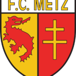
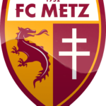
- The upper part of the shield was white and has a gold “F.C.
- Metz” lettering in all capitals on it.
- On the shield, there were two main club’s symbols placed — the maroon dragon on a yellow background, and the yellow Cross Lorraine on the maroon part of the crest.
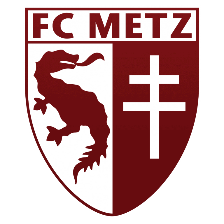
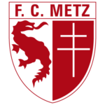
- 2000 — Today The traditional and classic logo was redesigned in 2000, in order to give the crest a more modern and contemporary look.
- The color palette of the emblem has been simplified to maroon and white; which made the whole image look stronger and more progressive.
- As for the wordmark, now it was in maroon, placed on a white background, and ex-ecuted in a sharp and bold sans-serif typeface with clean lines and distinct cuts of the edges.
- The FC Metz logo is simple yet every symbolic and reflects the club’s value of its roots, traditions, and legacy.
- The warm yet bright color palette of the team’s visual identity reflects their passion for football and willingness to win.





Leave a Review