Meritor logo and symbol, meaning, history, PNG
- Download PNG Meritor Logo PNG The roots of the brand can be traced as far back as to 1909 when Timken Detroit Axle was founded.
- However, it was only in 1997 when the company (it was now called Rockwell International) spun off its automotive division under the name of Meritor.
- Since then, the Meritor logo has preserved mostly unchanged.
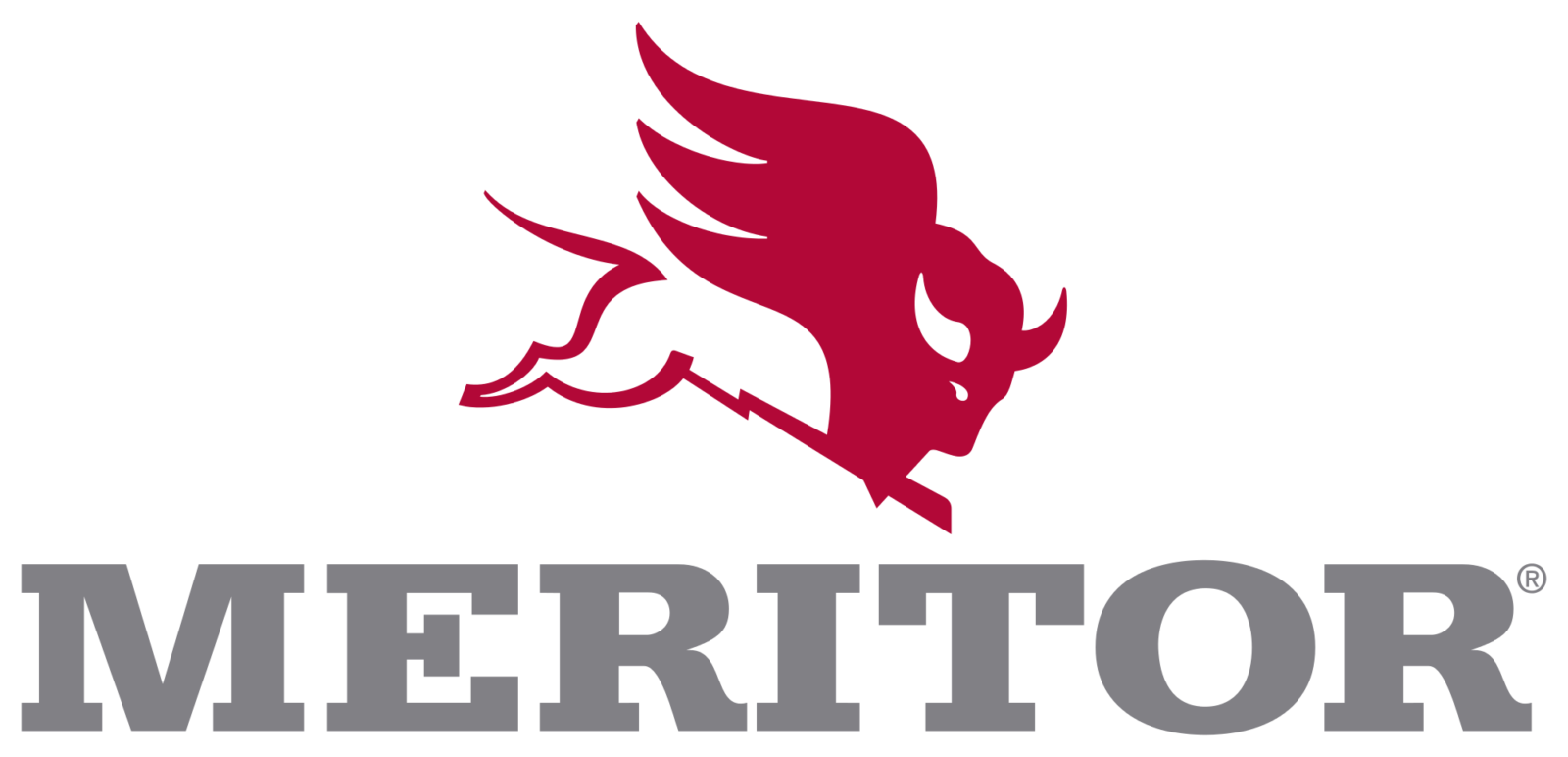
- Meaning and history The logo can be broken down into two parts.
- First, there is a pictorial part featuring a bull flying on something that looks like a lightning bolt.
- The bull has very visible red wings.
- Half of the bull’s body is dark red, while the other half is black (or white).
- The direction of his flight goes from the top left corner to the bottom right corner, so it seems that the animal is going to attack someone.
- To the left, the word “Meritor” in a bold slab serif type can be seen.
- It is either white (on the black background) or gray (on the white background).
- We should point out that there is certainly an infernal theme present in this design, which is especially noticeable when the logo appears on the black background (like on the official website).
- To begin with, the very color scheme combining black and red is reminiscent of the colors associated with the traditional representation of the devil and the infernal flame.
- The horns only reinforce the impression.
- Versions of the emblem The Meritor logo can be paired with the tagline “Run with the bull.” It can be given either in an artistic type with sharp ends or in a traditional sans.


Leave a Review