Meow Mix logo and symbol, meaning, history, PNG
- Download PNG Meow Mix Logo Meow Mix is an American brand of cat food manufacturer, which was established in 1974.
- Today the company also produces different supplements and cat health items, which are distributed worldwide.
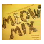
- It featured a bold stylized uppercase inscription, where each letter was formed by a caricature cat figure.
- The logotype was executed in a brown and orange color palette and set diagonally on a dark yellow background.
- 1987 – 2000 The redesign of 1987 changed the style of the inscription, drawing it in thick smooth lines of orange color on a yellow background.
- The lines in the bottom “Mix” level of the logotype were elongated and resembles the cat’s legs.
- The face of the animal was drawn with more details and its large green eyes were the brightest element of the whole emblem now.
- 2004 – 2007 The colors became even brighter in 2004, and the yellow background was changed to a white one, which added more contrast to the composition and made it look strong and delightful.
- As for all the other elements, they remained untouched.
- 2011 – 2018 The redesign of 2011 introduced a modern and minimalist (in comparison to all the previous badges) Meow Mix logo, where the custom and elegant orange lettering was placed on a white background.
- 2018 – Today The Meow Mix logo is composed of a wordmark in a custom typeface executed in a bright color palette.
- The main element of the inscription is the letter “W”, which elongated tail curves upright and resembles a silhouette of a cat.
- The bright orange color of the letters is accompanied by a thin white and red outline, which adds volume and dynamics to the inscription.
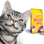
- When placed on the package, the logo gains a darker shade of orange, in order to better stand out on the yellow background.





Leave a Review